Building My Twitch Viewer Goal Widget
I enjoy side projects like this. A popular streamer was looking for a widget that would show a viewer count goal on Twitch. She couldn’t find anything like it on Etsy, so I thought I’d give it a try.
The First Approach: Server-Side
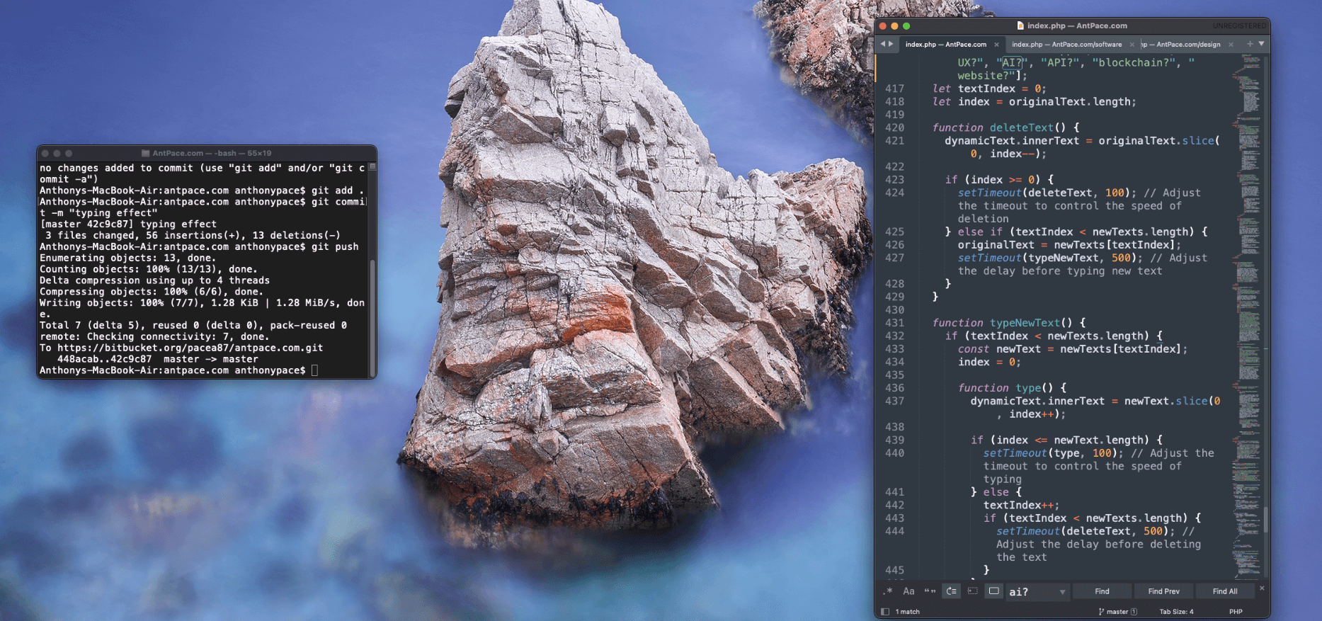
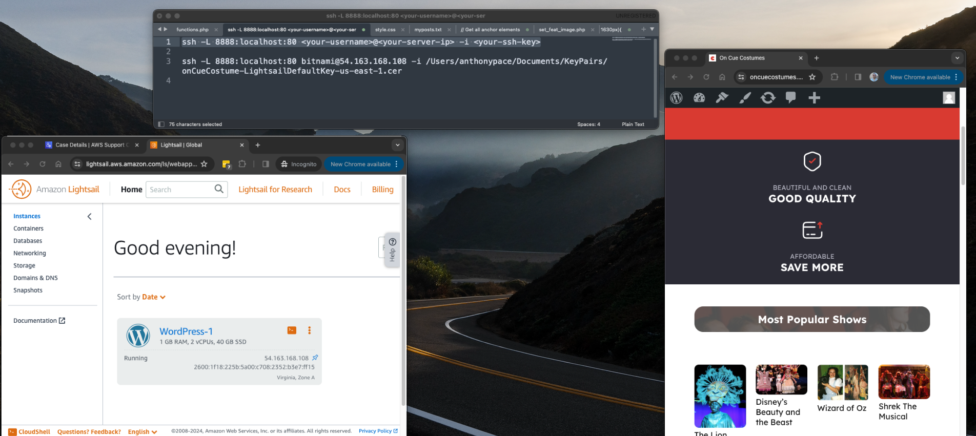
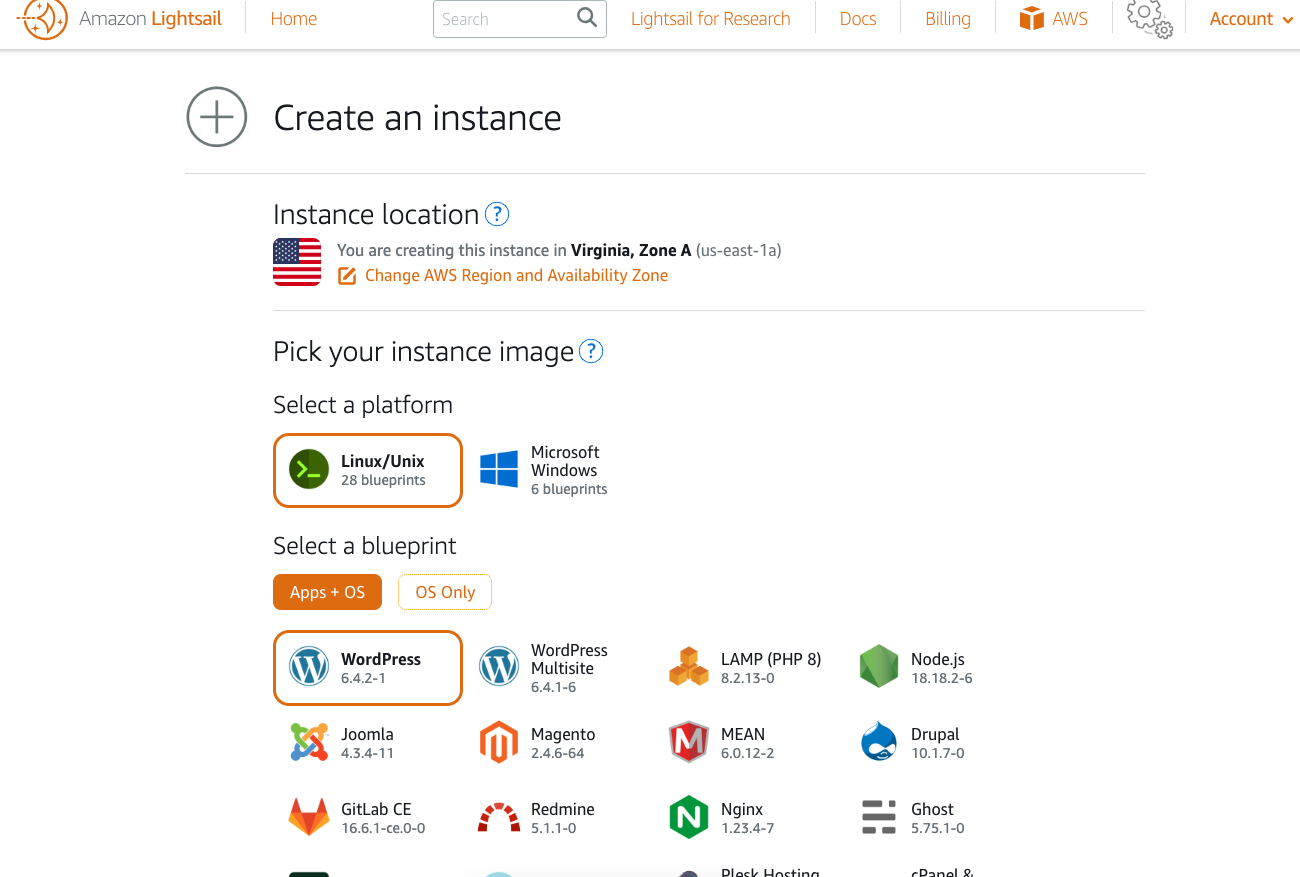
At first, I built a version that hit the Twitch API from a Node.js back-end. I spun up an Express server on an AWS Lightsail Node.js blueprint and vibe-coded the whole thing. It worked, but it came with major problems.
The Twitch Helix API requires authentication with both a client ID and a token. These credentials are essentially as sensitive as a password. Running the widget from my own server meant I would have to host those credentials. That made the project impossible to sell as a single-download file on Etsy. To cover costs, I’d need to charge a subscription fee, and I even risked losing money if nobody paid.
The experience wasn’t wasted, though. Configuring SSL on Lightsail was tricky but rewarding. I also had to hunt down a race condition in the server.js file that taught me a lot about debugging async code in Node. Even though I scrapped this approach, it might come in handy for future projects.
Here server file I ran to fetch the user count from Twitch’s Helix API:
const express = require("express");
const fetch = require("node-fetch"); // npm install node-fetch@2
const app = express();
const PORT = 3000;

// Read from environment
const CLIENT_ID = process.env.TWITCH_CLIENT_ID;
const CLIENT_SECRET = process.env.TWITCH_CLIENT_SECRET;

let ACCESS_TOKEN = "";

// Get App Access Token
async function getAccessToken() {
  try {
    const res = await fetch("https://id.twitch.tv/oauth2/token", {
      method: "POST",
      headers: { "Content-Type": "application/x-www-form-urlencoded" },
      body: `client_id=${CLIENT_ID}&client_secret=${CLIENT_SECRET}&grant_type=client_credentials`
    });

    const data = await res.json();

    if (data.access_token) {
      ACCESS_TOKEN = data.access_token;
      console.log("✅ New access token fetched:", ACCESS_TOKEN.slice(0, 10) + "...");
    } else {
      console.error("❌ Failed to fetch access token:", data);
    }

    return !!ACCESS_TOKEN;
  } catch (err) {
    console.error("❌ Error fetching access token:", err);
    return false;
  }
}

// Get user_id by username
async function getUserId(login) {
  try {
    const res = await fetch(`https://api.twitch.tv/helix/users?login=${login}`, {
      headers: {
        "Client-ID": CLIENT_ID,
        "Authorization": `Bearer ${ACCESS_TOKEN}`
      }
    });

    const text = await res.text();  // raw response
    let data;
    try {
      data = JSON.parse(text);
    } catch (e) {
      return { id: null, raw: text, error: "Failed to parse /users response" };
    }

    if (data.data && data.data.length > 0) {
      return { id: data.data[0].id, raw: text };
    }
    return { id: null, raw: text };
  } catch (err) {
    return { id: null, raw: null, error: err.message };
  }
}

// Endpoint: /viewer-count?login=username
app.get("/viewer-count", async (req, res) => {
  const login = req.query.login;
  if (!login) return res.status(400).json({ error: "Missing ?login=username" });

  if (!ACCESS_TOKEN) {
    return res.status(503).json({ error: "Twitch access token not ready" });
  }

  try {
    const { id: userId, raw: rawUserResponse, error: userError } = await getUserId(login);

    if (!userId) {
      return res.json({
        viewerCount: 0,
        status: "offline",
        userId,
        login,
        rawUserResponse,
        userError,
        clientId: CLIENT_ID,
        tokenPrefix: ACCESS_TOKEN ? ACCESS_TOKEN.slice(0, 10) : "undefined"
      });
    }

    const streamRes = await fetch(`https://api.twitch.tv/helix/streams?user_id=${userId}`, {
      headers: {
        "Client-ID": CLIENT_ID,
        "Authorization": `Bearer ${ACCESS_TOKEN}`
      }
    });
    const streamText = await streamRes.text();
    let streamData;
    try {
      streamData = JSON.parse(streamText);
    } catch (e) {
      return res.json({
        viewerCount: 0,
        status: "offline",
        userId,
        login,
        rawUserResponse,
        rawStreamResponse: streamText,
        streamError: "Failed to parse /streams response"
      });
    }

    if (streamData.data && streamData.data.length > 0) {
      const count = streamData.data[0].viewer_count;
      return res.json({
        viewerCount: count,
        status: "live",
        userId,
        login,
        rawUserResponse,
        rawStreamResponse: streamData
      });
    } else {
      return res.json({
        viewerCount: 0,
        status: "offline",
        userId,
        login,
        rawUserResponse,
        rawStreamResponse: streamData
      });
    }
  } catch (err) {
    res.status(500).json({ error: "Failed to fetch viewer count!", details: err.message });
  }
});

// Serve static frontend
app.use(express.static("public"));

// Refresh token every hour
setInterval(getAccessToken, 60 * 60 * 1000);

// Start server ONLY after a valid token is fetched
(async () => {
  const ok = await getAccessToken();
  if (ok) {
    app.listen(PORT, () =>
      console.log(`🚀 Widget running on http://localhost:${PORT}`)
    );
  } else {
    console.error("❌ Could not start server: Twitch token fetch failed");
    process.exit(1);
  }
})();

// Config page
app.get("/config", (req, res) => {
  res.sendFile(__dirname + "/public/config.html");
});
And an early version of the front-end HTML file that actually makes up the widget user-interface:
<!DOCTYPE html>
<html>
<head>
  <title>Twitch Viewer Goal Widget</title>
  <style>
    body {
      background: transparent;
      font-family: Arial, sans-serif;
      text-align: center;
      margin-top: 50px;
      color: #fff;
      overflow: hidden; /* keep confetti visible but not add scrollbars */
    }

    .goal-square {
      position: relative;
      width: 120px;
      height: 120px;
      margin: 0 auto;
      border-radius: 20px;
      background: #5a3e1b;
      overflow: hidden;
      box-shadow: 0 4px 15px rgba(0,0,0,0.4);
      border: 3px solid #8b5e34;
      transition: opacity 1s ease-in-out;
      z-index: 2;
    }

    .goal-fill-container {
      position: absolute;
      bottom: 8px;
      left: 8px;
      right: 8px;
      top: 8px;
      border-radius: 14px;
      overflow: hidden;
      z-index: 1;
    }

    .goal-fill {
      position: absolute;
      bottom: 0;
      width: 100%;
      height: 0%;
      background: linear-gradient(
        180deg,
        #fffacd 0%,
        #ffe135 40%,
        #f4c542 100%
      );
      transition: height 1s ease-in-out;
      border-radius: 0 0 14px 14px;
    }

    .sparkle {
      position: absolute;
      top: 0;
      left: -150%;
      width: 200%;
      height: 100%;
      background: linear-gradient(
        120deg,
        transparent 0%,
        rgba(255,255,255,0.3) 50%,
        transparent 100%
      );
      animation: shimmer 15s infinite;
      z-index: 3;
      pointer-events: none;
      opacity: 0;
    }

    @keyframes shimmer {
      0%   { transform: translateX(-150%); opacity: 0; }
      2%   { transform: translateX(-50%);  opacity: 1; }
      6%   { transform: translateX(100%);  opacity: 0; }
      100% { transform: translateX(100%);  opacity: 0; }
    }

    .goal-icon {
      position: absolute;
      top: 50%;
      left: 50%;
      transform: translate(-50%, -50%);
      font-size: 18px;
      font-weight: bold;
      text-transform: uppercase;
      color: #ffe135;
      z-index: 4;
      animation: breathe 3s ease-in-out infinite;
      -webkit-text-stroke: 1px #000;
      text-shadow:
        1px 1px 2px #000,
       -1px 1px 2px #000,
        1px -1px 2px #000,
       -1px -1px 2px #000;
    }

    @keyframes breathe {
      0%, 100% { transform: translate(-50%, -50%) scale(1); }
      50% { transform: translate(-50%, -50%) scale(1.1); }
    }

    #status {
      margin-top: 15px;
      font-size: 18px;
      color: #ffe135;
      text-shadow: 0 1px 2px rgba(0,0,0,0.4);
      transition: opacity 1s ease-in-out;
    }

    .hidden {
      opacity: 0;
      pointer-events: none;
    }

    .explode {
      animation: explodePulse 3s ease-out forwards;
    }

    @keyframes explodePulse {
      0%   { transform: scale(1);   box-shadow: 0 0 20px rgba(255,255,0,0.5); }
      25%  { transform: scale(1.3); box-shadow: 0 0 50px rgba(255,255,0,1); }
      50%  { transform: scale(1);   box-shadow: 0 0 25px rgba(255,255,0,0.7); }
      75%  { transform: scale(1.2); box-shadow: 0 0 40px rgba(255,255,0,0.9); }
      100% { transform: scale(1);   box-shadow: 0 0 15px rgba(255,255,0,0.4); }
    }

    .confetti {
      position: fixed;
      width: 10px;
      height: 10px;
      top: 50%;
      left: 50%;
      opacity: 0.9;
      animation: confettiFall 6s ease-out forwards;
      z-index: 10;
    }

    @keyframes confettiFall {
      0%   { transform: translate(0,0) scale(1); opacity: 1; }
      100% { transform: translate(var(--x), var(--y)) rotate(1440deg) scale(0.5); opacity: 0; }
    }

    .flash-text {
      animation: flashText 1s alternate infinite;
    }

    @keyframes flashText {
      from { color: #ffe135; }
      to   { color: #ff4444; }
    }
  </style>
</head>
<body>
  <div id="widget">
    <div class="goal-square" id="goal-square">
      <div class="goal-fill-container">
        <div id="goal-fill" class="goal-fill"></div>
      </div>
      <div class="sparkle"></div>
      <div id="goal-icon" class="goal-icon">Viewer Count Goal</div>
    </div>
    <div id="status">Checking stream status...</div>
  </div>

  <script>
    /* === CONFIG CONSTANTS === */
    const CONFIG = {
      apiEndpoint: "/viewer-count",
      pollInterval: 5000,
      confettiCount: 80,
      confettiDuration: 6000,
      explosionDuration: 3000,
      celebrationDuration: 6500,
      confettiColors: ["#ff0", "#f00", "#0f0", "#0ff", "#f0f", "#fff"]
    };

    /* === PARAMS WITH GUARDRAILS === */
    const params = new URLSearchParams(window.location.search);

    let login = params.get("login") || "unknown"; // demo if missing

    let threshold = parseInt(params.get("threshold"), 10);
    if (isNaN(threshold) || threshold <= 0) threshold = 50; // safe default

    const hideCount = params.get("hideCount") === "true";

    let hideUntilPercent = parseInt(params.get("hideUntilPercent"), 10);
    if (isNaN(hideUntilPercent) || hideUntilPercent < 0 || hideUntilPercent > 100) {
      hideUntilPercent = 0;
    }

    const widgetEl = document.getElementById("widget");
    const goalSquare = document.getElementById("goal-square");
    const statusEl = document.getElementById("status");

    let goalReached = false;
    let demoCount = 0; // for demo mode

    function triggerExplosion() {
      goalSquare.classList.add("explode");
      setTimeout(() => goalSquare.classList.remove("explode"), CONFIG.explosionDuration);

      const oldText = statusEl.textContent;
      statusEl.textContent = "🎉 GOAL REACHED! 🎉";
      statusEl.classList.add("flash-text");

      for (let i = 0; i < CONFIG.confettiCount; i++) {
        const c = document.createElement("div");
        c.className = "confetti";
        c.style.background = CONFIG.confettiColors[Math.floor(Math.random() * CONFIG.confettiColors.length)];
        const angle = Math.random() * 2 * Math.PI;
        const distance = 200 + Math.random() * 300;
        const x = Math.cos(angle) * distance + "px";
        const y = Math.sin(angle) * distance + "px";
        c.style.setProperty("--x", x);
        c.style.setProperty("--y", y);
        document.body.appendChild(c);
        setTimeout(() => c.remove(), CONFIG.confettiDuration);
      }

      setTimeout(() => {
        statusEl.textContent = oldText;
        statusEl.classList.remove("flash-text");
      }, CONFIG.celebrationDuration);
    }

    async function fetchViewerData() {
      // Demo mode if no login
      if (login === "unknown") {
        demoCount += Math.floor(Math.random() * 5) + 1; // increment by 1–5
        if (demoCount > threshold + 10) demoCount = 0;   // reset after surpassing
        return { status: "online", viewerCount: demoCount };
      }

      // Normal mode
      const res = await fetch(`${CONFIG.apiEndpoint}?login=${login}`);
      return res.json();
    }

    async function checkViewers() {
      try {
        const data = await fetchViewerData();
        const fill = document.getElementById("goal-fill");

        if (data.status === "offline") {
          statusEl.textContent = `${login} is offline`;
          fill.style.height = "0%";
          widgetEl.classList.add("hidden");
          goalReached = false;
        } else {
          const count = data.viewerCount;
          const progress = Math.min((count / threshold) * 100, 100);
          fill.style.height = `${progress}%`;

          if (hideCount) {
            statusEl.textContent = "";
          } else {
            statusEl.textContent = `${count} / ${threshold}`;
          }

          widgetEl.classList.toggle("hidden", progress < hideUntilPercent);

          if (progress >= 100 && !goalReached) {
            goalReached = true;
            triggerExplosion();
          }
        }
      } catch (err) {
        statusEl.textContent = "Error loading viewer count";
      }
    }

    setInterval(checkViewers, CONFIG.pollInterval);
    checkViewers();
  </script>
</body>
</html>
A Better Idea: Stand-Alone File
The real breakthrough came when I decided to cut out the server entirely. Instead of me hosting credentials, I let users generate their own. They paste their Twitch token and client ID directly into the widget’s settings. To do this, I relied on a third-party website (twitchtokengenerator.com) that safely walks them through the process.
This meant I had no recurring costs. My only investment is my time. That’s a big win.
I also moved the widget’s settings out of query parameters and into a simple configuration block inside the file. That made things cleaner and easier for users to customize.
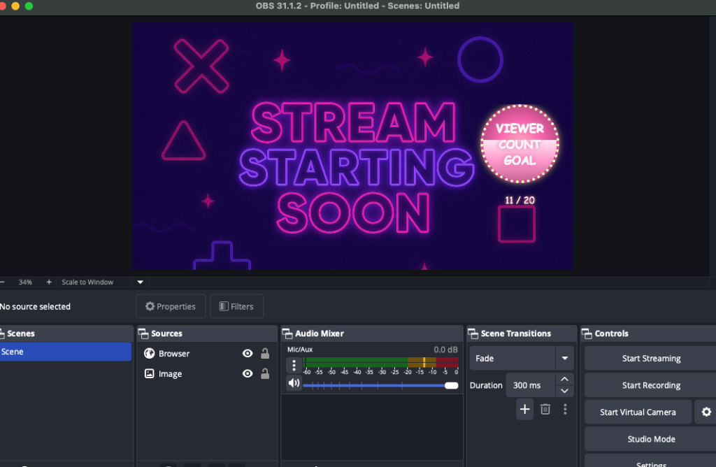
Product Features
When I packaged the widget for release, I wanted to make sure it wasn’t just functional but also customizable and fun to use. Here are some of the features that made it into the final version:
- Viewer Goal Tracking – The widget dynamically displays your current Twitch viewer count and progress toward a goal you set.
- Customizable Goals – Streamers can easily edit the settings inside the file to choose their own goal number, username, and other preferences.
- Visual Themes – I experimented with playful themes like bananas, moons, and fire, giving streamers a way to match the widget’s style to their stream vibe.
- Animated Progress Fill – As the viewer count grows, the widget smoothly fills up with color, creating a clear and engaging visual effect for the audience.
- Celebration Triggers – When the goal is reached, the widget can display a celebratory effect to highlight the achievement live on stream.
- Easy Setup Instructions – To make onboarding painless, I provided a PDF guide and demo video, along with clear links to generate a Twitch token.
- No Server Required – Because the widget runs completely client-side, there are no recurring costs or subscriptions. Streamers own the file outright after purchase.
These features make the widget simple enough for beginners to set up, but flexible enough for experienced streamers to customize and show off during their broadcasts.
User Testing and Iterations
Once I had a working prototype, I shared it for testing. Immediately, we hit friction.
- The instructions had a broken URL.
- The token generation process was confusing.
- People weren’t sure how to edit the file. Some tried to open it without unzipping first. Others used the wrong text editor.
Luckily, my first tester was already familiar with Twitch widgets and gave me some great feedback. For example, instead of providing instructions as a .txt file, I switched to a clean PDF guide.
These details matter. If users can’t get through setup, they’ll abandon the product.
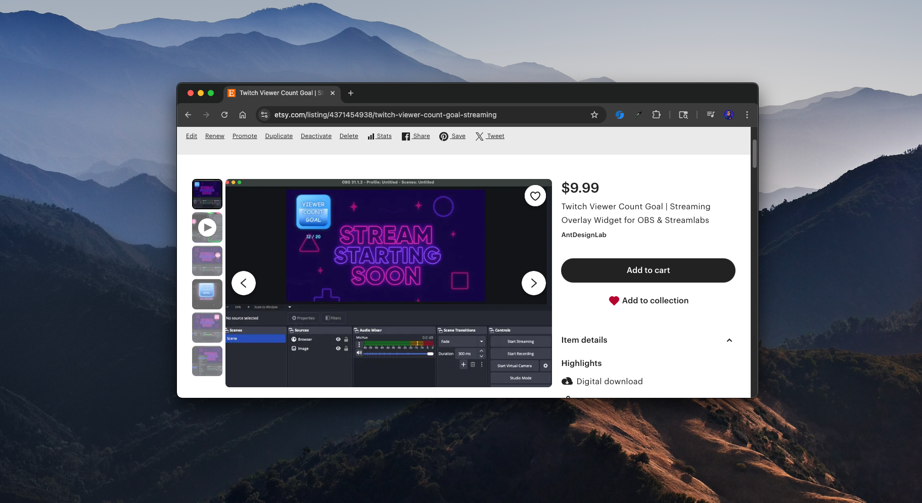
Selling the Widget
I decided to sell the widget as a digital download. At first, I planned to use Etsy for its built-in marketplace and discoverability. But I also set up direct sales on my own website with Stripe. That way I control the checkout experience and don’t have to rely on a third party.
The full package now includes:
- A web instructions page
- A PDF instructions file
- A dedicated landing page
- An Etsy listing
- A YouTube video demo with setup instructions (I invalidated my token afterward, just to be safe)
Marketing the Widget
The marketing plan is straightforward:
- Post about it on social media
- Share demo videos on YouTube and TikTok
- Reach out to small streamers and influencers who might find it useful
- Optimize listings on marketplaces like Etsy
The idea is to start simple and see where it goes.
Looking Back
This project taught me a lot about balancing technical decisions with business models. Building a server-side widget was fun and educational, but not sustainable. The stand-alone approach keeps things lightweight, low-cost, and sellable.
Most of all, I had fun building something useful. And who knows? Maybe it will grow into a steady digital product line.