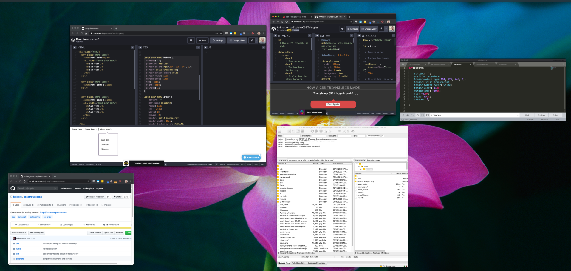
Here’s a quick one about how to create a drop-down UI element with an arrow via CSS. The aim is to create a menu that has drop-down sub-menus. Each drop-down should have an arrow that points up towards the parent element.
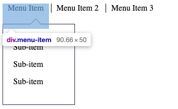
I line the menu-items in a row by setting display to ‘inline-block’. This is preferred over just ‘inline’, so that their height property is respected. This is important because I will create space between the parent item and sub-menu. If the two elements don’t actually overlap, then the hover state will be lost, closing the drop-down. See what I mean:
The sub-menu element overlaps with the parent item, so that the hover state is not lost.
I also set the parent item position to relative, so that the drop-down will be absolutely positioned respective to it.
The sub-menu styling is straight-forward. I set it to display: none, set a width, add a border and padding, and position it absolutely. Its top value pushes it off of the parent item a bit. Setting a left value to zero ensures that it will be aligned with its parent. (If you don’t set a left value, multiple sub-menus will all stack under the very first parent item.)
The next step is building the arrow in the drop-down menu. The challenge is making the arrow’s border blend seamlessly with the container’s border. The illusion is achieved by overlapping the :before and :after pseudo-elements.
The triangle shape that forms the arrow is achieved by giving a bottom border to an element with no height or width. This code pen animation does a phenomenal job of explaining the idea: https://codepen.io/chriscoyier/pen/lotjh
The drop-down’s :before element creates the white triangle that is the heart of the arrow itself. This also creates the gap in the sub-menu’s actual top border
The :after element creates another triangle that is behind and slightly above the first one – creating the illusion of a border that connects just right with the menu’s.
The illusion can be better revealed by manipulating the position and border-width of these pseudo-elements in the inspector.
Here is the code I used for those pseudo elements:
As programmers, we are creators and innovators. Design should mean more to us than just software architecture and “API design.” Graphic design, UI and user experience play a role in what we deliver as digital creators
The importance of typography cannot be understated in design.
Readability – cursive and serifs for headings; san-serif for body text
Choosing font pairs is essential to ensure consistency and visual appeal.
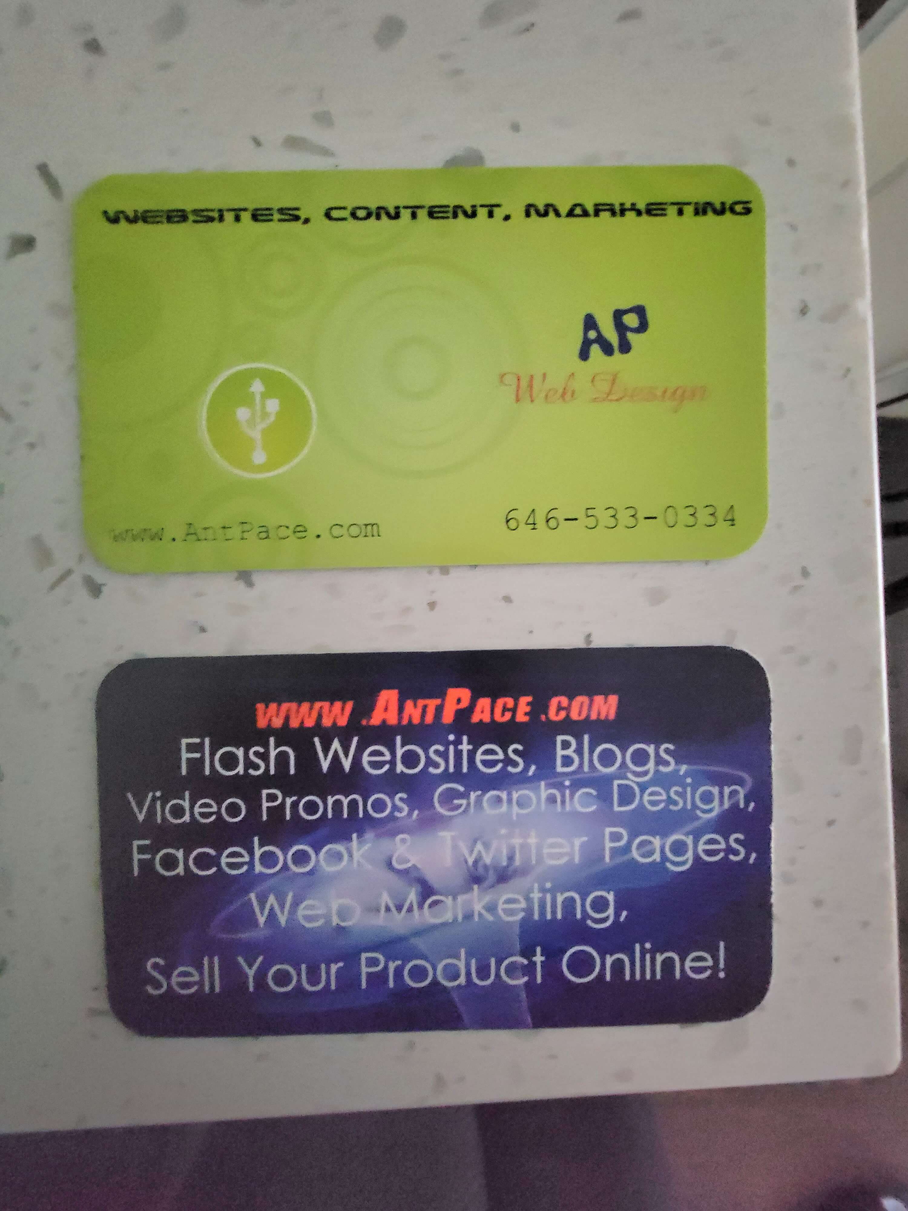
When I first started doing freelance work (circa 2007) I was mostly a programmer, and had a hard learning curve for design. I made the mistake of randomly selecting unrelated fonts and slapping them together. One time, I designed ugly (in retrospect; at the time, I thought they were amazing) looking business cards for myself. I order 10,000 of them! I remember I ordered them from GotPrint.net after watching a YouTube video recommendation.
AntPace.com business cards from 2008
I got through maybe one thousand of them, ever. Until recently, I still had boxes of them stored in my parent’s basement, back in the Bronx. I keep a few in my archives just for memories.
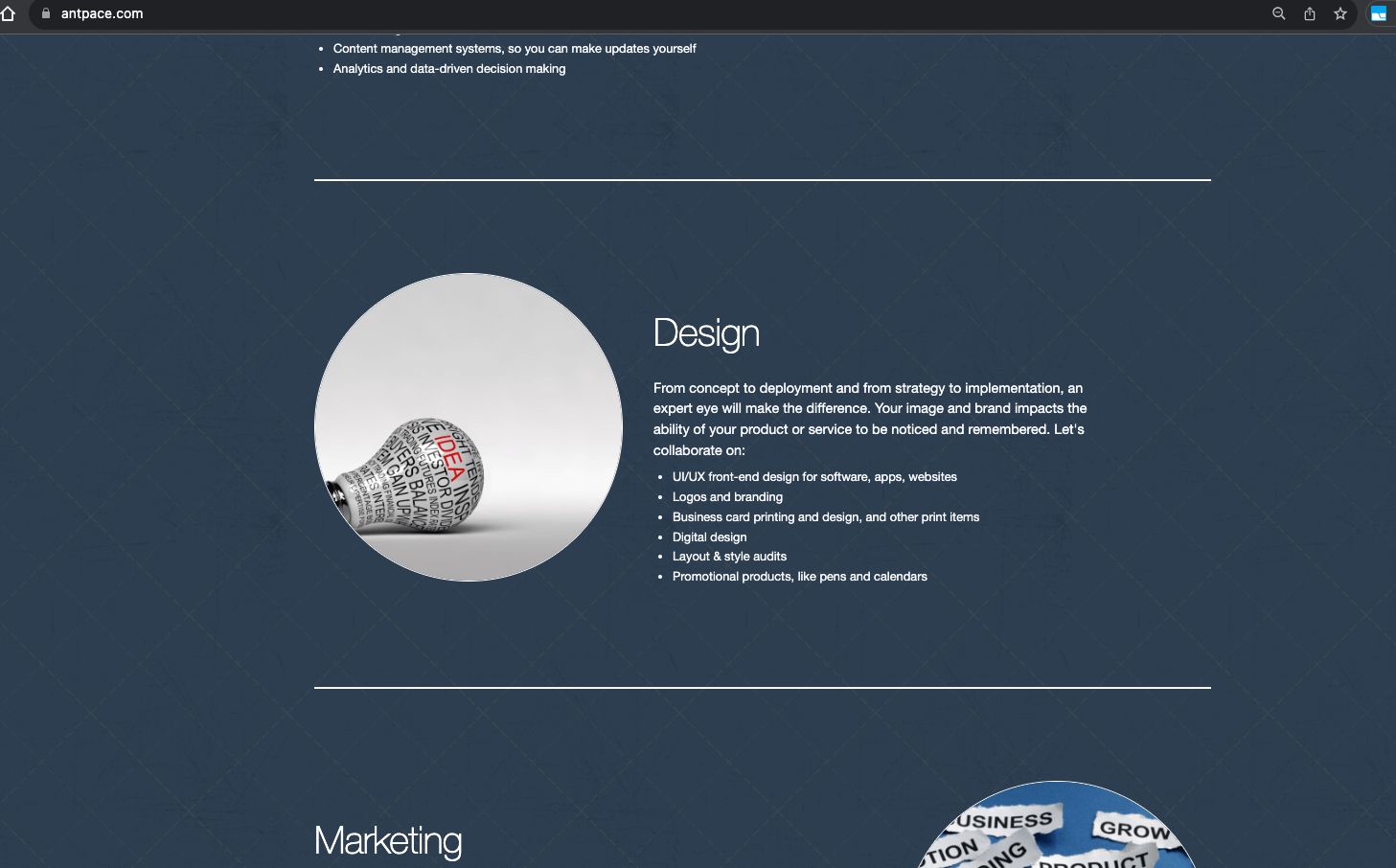
Subtle background patterns can enhance a design. For an example, checkout this website’s homepage.
A subtle background pattern
Using an image as a background, especially if it’s blurred or darkened and turned black & white, can create a stunning visual effect.
Adding icons to a heading is a way to make a design look more “finished”
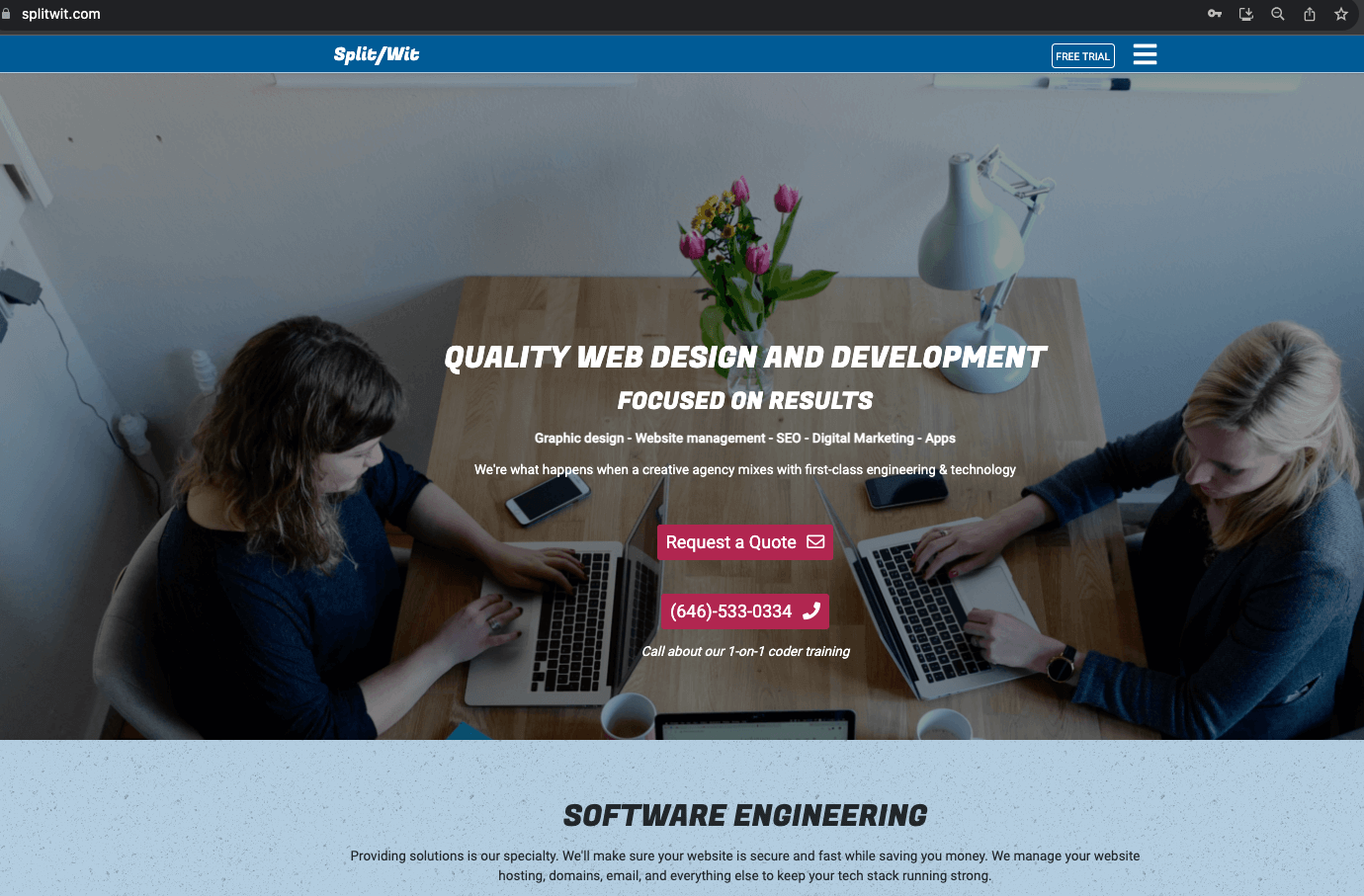
Using a white font with a semi-transparent black layer on top of the image background can make the text pop out and increase readability.
I can achieve this effect using the GIMP. Once I have an image open, I add a new layer on top. I fill that layer all black. Finally, I lower the opacity of that layer to about 50%. You can see examples of this on www.SplitWit.com
I can use CSS to add a transparent shadow to a div that has a background image (that is what I use on my portfolio page):
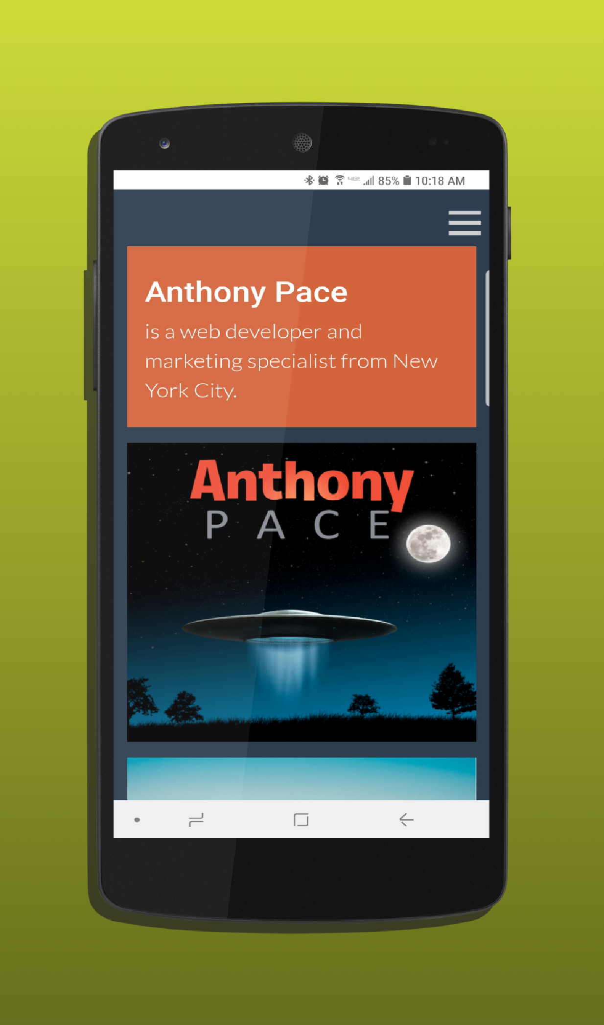
When considering a logo, decide between using just text or incorporating an image for branding. Consider the “Anthony Pace” logo on this website.
When design my own textual logo, the techniques I found most useful: kearning (letter spacing), drop shadows, and lighting effects.
Using apps such as Canva makes it fun and easy. Is AI and automatic tooling replacing designers?
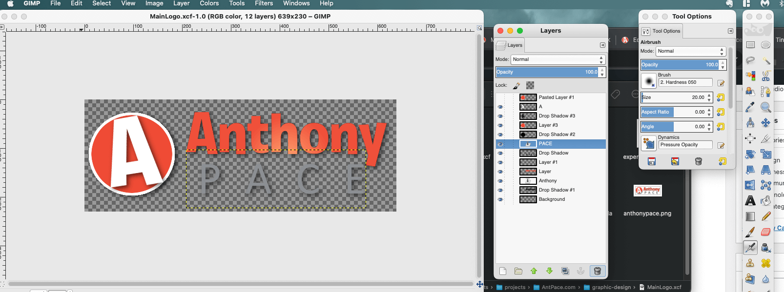
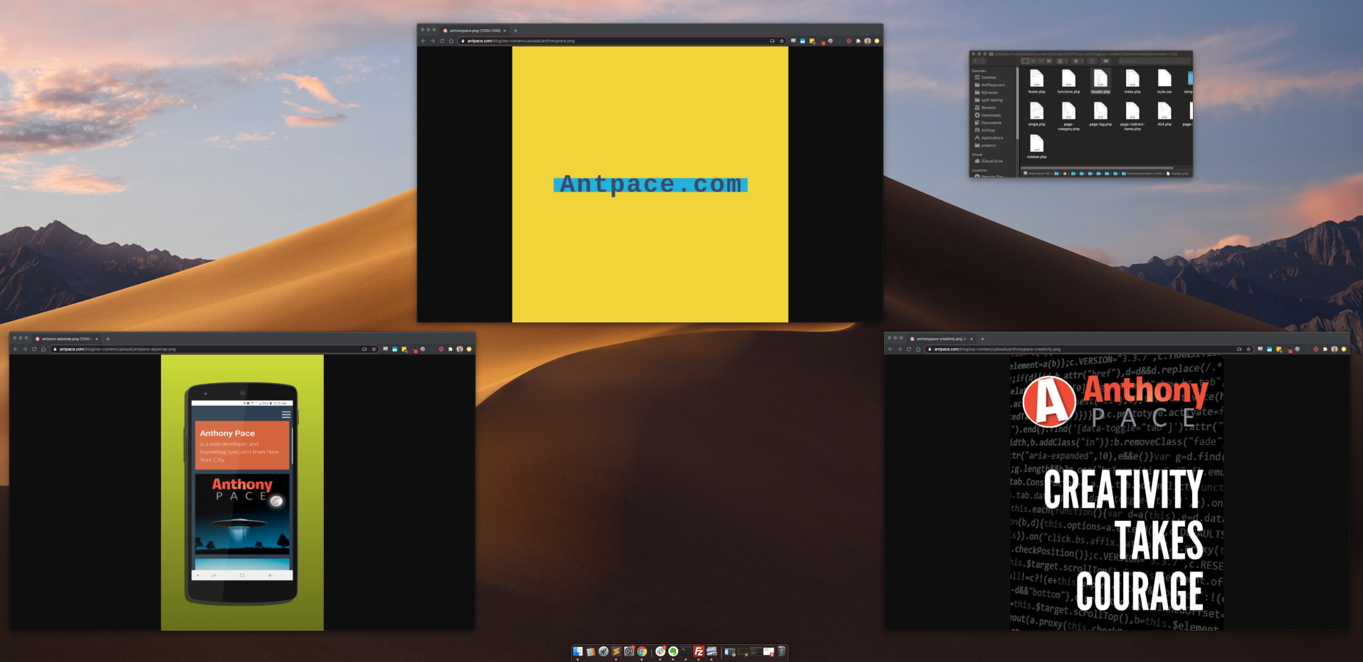
The logo that I use for this website (check the top-left menu, or my homepage’s hero space) has went through numerous iterations. I built it using the GIMP (which has been my tool of choice for over twenty years. I first started using it around 2002- and that’s when I learned that opacity is the opposite of transparency).
#todo: Add GIMP tutorials for techniques I often use. ie, Images with Text on top; The importance of padding.
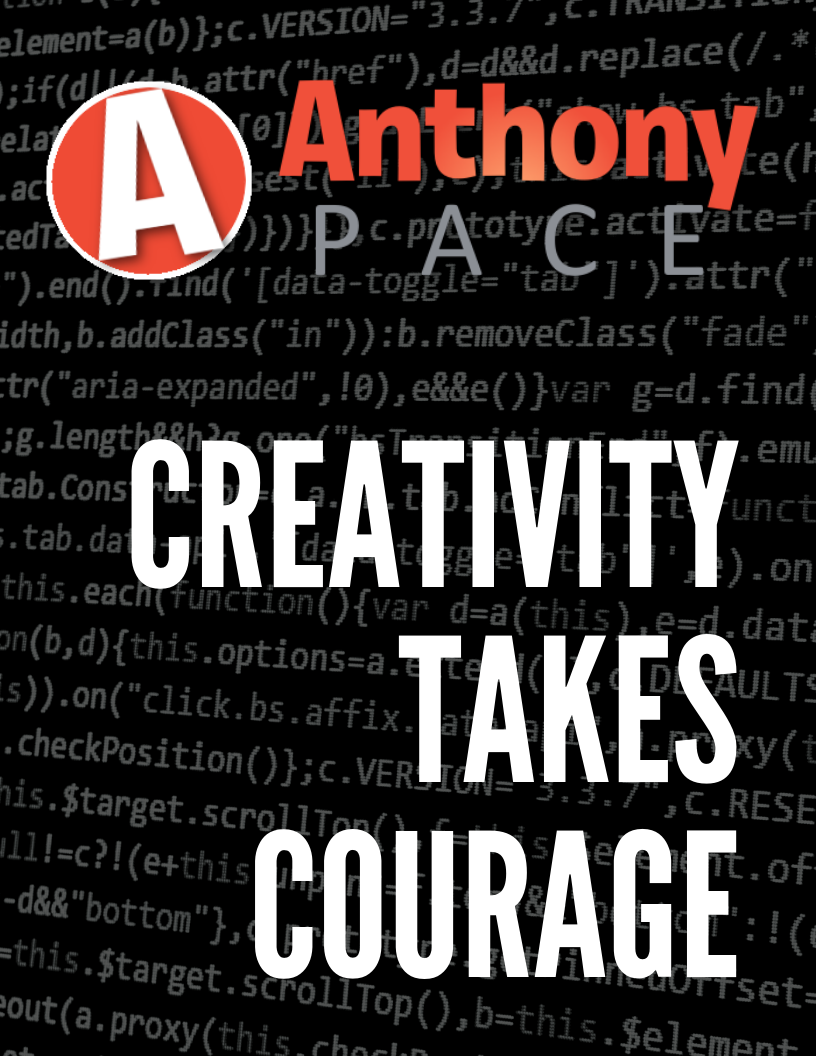
An important typography technique I leveraged was kearning. I adjusted the spacing between the letters in my last name “PACE” to make it wider, and I used all capital letters. This gave it a sturdy feeling (something which I meant to convey). This formed a strong base for “Anthony” to balance on top of.
Each letter has a subtle drop-shadow, just barely noticeable, giving a *pop*. And the text center (check the “h” in “Anthony”) has a lighting effect (in GIMP, “Filters” -> “Light and Shadow” -> “Lighting effects…”) that draws attention.
Originally, the text logo (referred to as “wordmark” or “logotype”) I use today (circa 2024) was displayed next to a circled “A” (that I now use as the site’s favicon). Separating those two elements was a simplification that added a feeling of professionalism to my brand.
Pro-tip: Padding and whitespace is your friend. Avoid letting things look cramped – give your UI elements plenty of space to breathe.
You can see me employ some of these ideas on the YouTube screen recording embedded below. You’ll notice that in this version of GIMP (2024) to access the “alignment tool”, I need to first select the “move” tool, and then press “q” on the keyboard.
This same concept was stylized into many other renditions (see below). The fonts I used: Pacifico, Exo, Roboto. You can find artifacts of this throughout www.AntPace.com
A legacy logo design from this websiteA design asset for my freelance businessI enjoy the outer space theme throughout AntPace.comThis was originally created in the GIMP and used stock imageryAt first, I wasn’t sure if my blog and main site should have different brand identities
1) Using an existing CSS feature to deliver a better or unique user experience. When applying animations and effects, the possibilities seem limitless.
2) A doctor prescribing a drug, off label, to treat a problem for which it wasn’t originally intended.
3) A trained athlete combining existing techniques into a unique style.
Although creative, these examples aren’t innovative. Innovation creates something new and moves the world forward. It creates new products, new industries, and new markets. It takes existing concepts and rearranges them to fit a unique pattern.
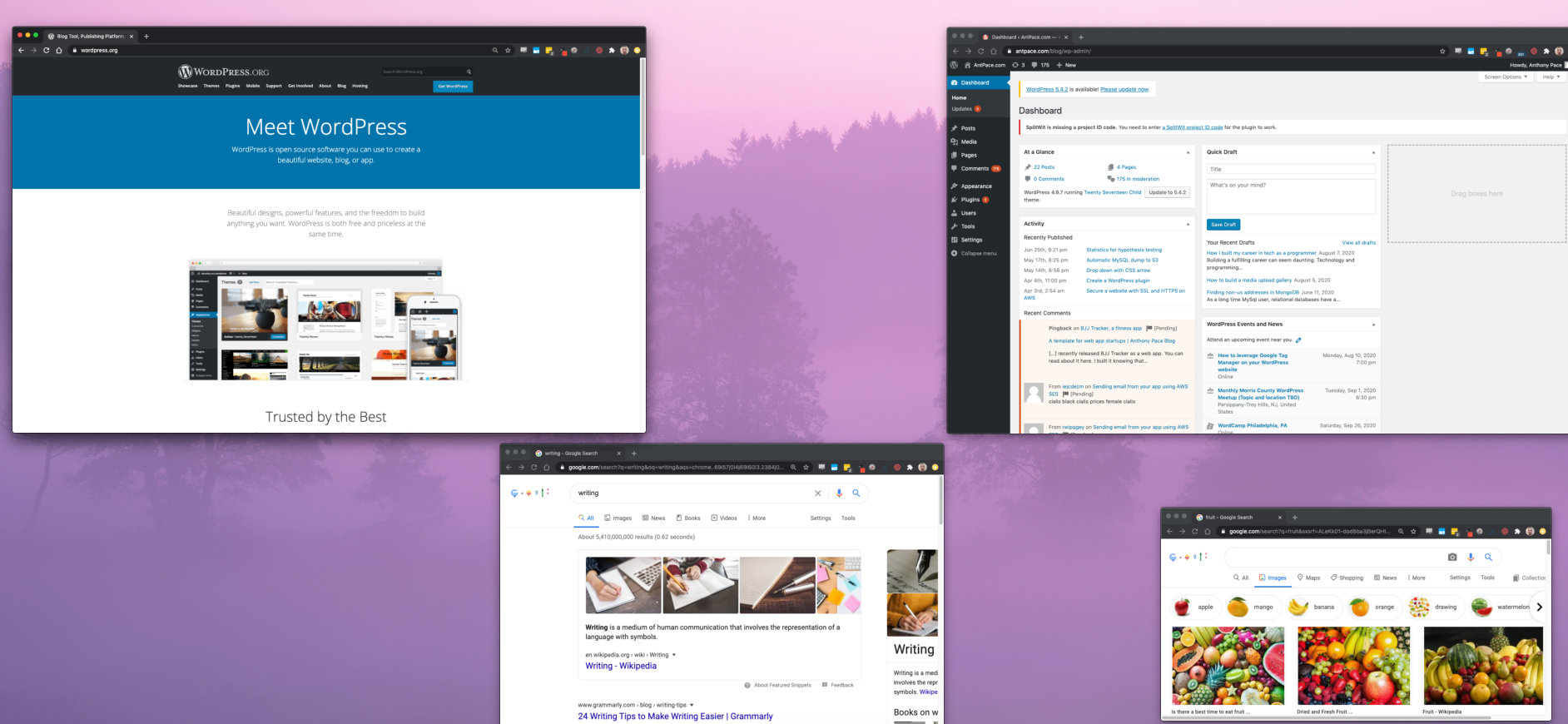
An outlet for my design creativity is the featured images used for each of my blog posts. Take a minute to scroll through them on my blog’s homepage. I usually take existing screenshots relevant to a piece’s subject matter, and juxtapose them against a desktop background. Sometimes, I create collages from random camera photos saved from old phones too.
Innovation
Innovation changes the space in which you’re working. In the next decade I will focus on that kind of growth, and expand past client-specific work. As a broad stroke, this means building digital products. Specifically, I’ll be taking the opportunity to solve problems in certain areas. Luckily, there are many exciting problems that need solving.
Innovative solutions require energy – and here are some places I’d like to spend mine.
1) Digital accessibility, and solving technology problems for people with disabilities. This will include software, as well as physical products. I’d like to explore how IOT, wearables, and augmented/virtual reality can be leveraged.
2) Privacy. This issue also seems to include homelessness, the justice system, and personal identity.
3) Business and marketing. These solutions are important, because I can re-use them as tools in other ventures. They can be leveraged to solve other important problems.
Working with Designers (as a programmer)
Receiving designs that don’t scale. Not having explicit designs for CSS break-points. Working with Figma. Using your best judgment as a front-end engineer.
* This post, like all of my blog entries, is a work-in-progress.
Any product, experience, or artwork – anything you build – is made up of pieces. And content always sits at the center. Content is the fleshy part of media.
The other pieces include structure, style, and functionality. These parts layout a skeleton, decorates the aesthetic, and adds usefulness. This model translates well to modern web development. HTML defines the structure. CSS describes the style. JavaScript adds interactivity. But always, content is King.
That’s why a robust content management system (CMS) is critical. Most clients prefer to have one. It makes updates easy. WordPress is the modern choice. It’s what this blog is built on.
WordPress Website
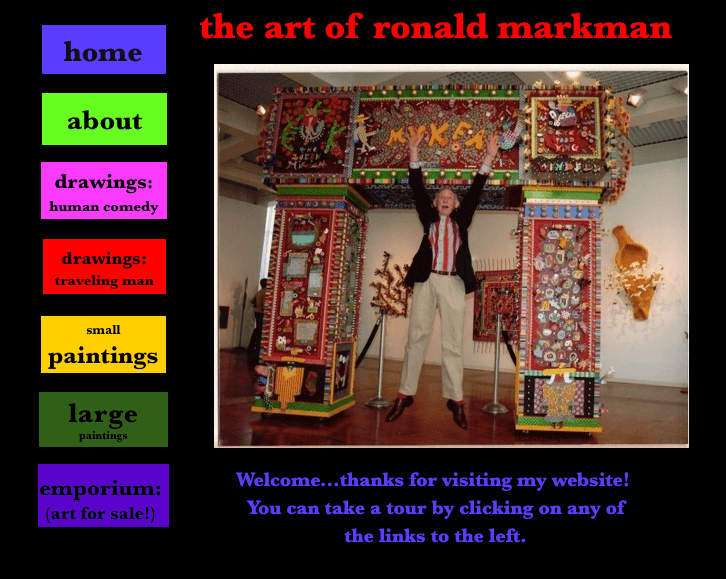
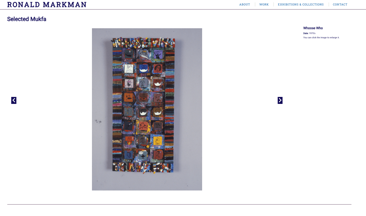
A website I built featured the work of visual artist Ron Markman – paintings, etchings, photos. It had a lot of content. A lot of content that needed massaging. As you may have guessed, I chose WordPress to manage it. I choose the HTML5 Blank WordPress Theme as our starting point.
I was recommended to Ericka by a previous client. Her late relative left behind a corpus of work that needed a new digital home. They already had a website, but needed it revamped and rebuilt from scratch.
This was my proposal:
“The look and feel will be modern, sleek, and adaptive. The homepage will feature a header section highlighting selected work. The website’s menu will link to the various category pages (as well as any ancillary pages). The menu, along with a footer, will persist throughout all pages to create a cohesive experience and brand identity. The website will be built responsively, adapting to all screen-sizes and devices. As discussed, select content will feature “zooming” functionality.”
This was a situation where I had to be a project manager, and deliver results. Although the content itself was impressive, it was delivered as image files in various formats and different sizes. Filenames were not consistent. And the meta-data – descriptions, titles, notes – was listed is excel files that didn’t always match-up to the image’s filename. This required a lot of spot checking, and manual work. I did my best to automate as much as I could, and make things uniform.
Phases of Work
I broke the work out into four phases. This is how I described it to the client:
Layout and hierarchy
I will provide wire-frame layouts describing the essential structure, layout and hierarchy of the website overall.
Look and feel
I will finalize aesthetic details such as color palette, typography, user interface, and stylization.
Implementation
I will build and deploy the website with the content provided.
Content input
You’ll need to provide all copy, images, media, etc. before a first build of the website can be deployed. I’ll be implementing a standard content-management system that will allow you to add additional content, categories, pages, etc. Often times, content delivery can be a bottleneck for projects like this. After the finalized website is deployed live, with the initial content provided, you’ll be responsible for adding any more additionally.
Image Gallery
The UI to show each piece of art was powered by Galleria. It was out-of-the-box responsive. At first, each gallery page had so many large image files that things would crash or load very slowly. I was able to leverage the framework’s AJAX lazy loading to mitigate that issue.
Resizing Multiple Images
Resizing a batch of images can be done directly in Mac OS by selecting the files, and opening them in Preview. From the ‘Edit’ menu, I clicked ‘Select All’. Then, in the ‘Tool’ menu I found ‘Adjust Size’. Windows has a similar feature, as does other image manipulation apps.
Renaming Multiple Files
I had to make the filenames match what was listed in the meta-data spreadsheet. Here’s the command I used, in Mac OS, to truncate filenames to the first eight characters:
rename -n 's/(.{8}).*(\.jpg)$/$1$2/' *.jpg
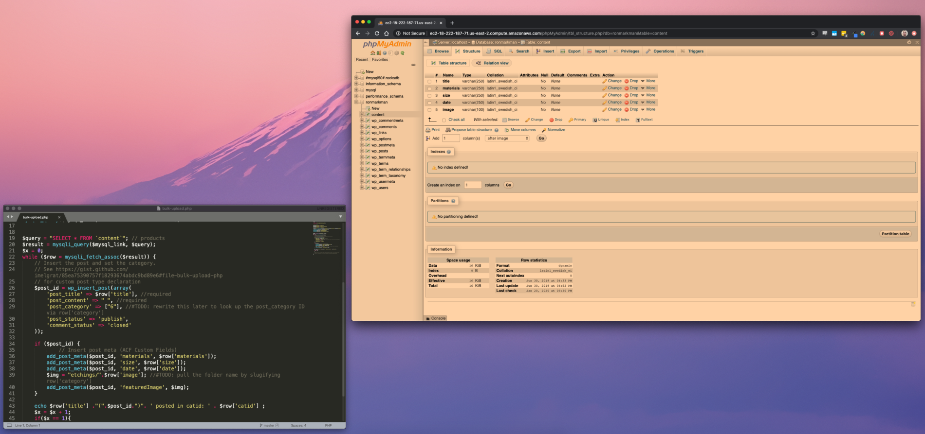
Batch Uploading WordPress Posts
Each piece of art was a WordPress post, with a different title, meta-values, and image. Once all of the files were sized and named properly, I uploaded them to the server via sFTP. Each category of art (paintings, photos, etc.) was a folder. I created a temporary database table that matched the columns from the meta-data spreadsheet I was given.
CREATE TABLE `content` (
  `content_id` int,
  `title` varchar(250) NOT NULL,
  `medium` varchar(250) NOT NULL,
  `category_id` varchar(250) NOT NULL,
  `size` varchar(250) NOT NULL,
  `date` varchar(250) NOT NULL,
  `filename` varchar(100) NOT NULL,
  `processed` int
) ENGINE=InnoDB DEFAULT CHARSET=latin1;
COMMIT;
I wrote a PHP script that would loop through all records, and create a new post for each. I had to make sure to include core WordPress functionality, so that I would be able to use the wp_insert_post() method.
require_once('/var/www/html/wp-load.php');
Once I connected to the database, I queried my temporary table, excluding any records that have been marked as already uploaded:
$query = "SELECT * FROM `content` where `processed` != 1";
$result = mysqli_query($mysql_link, $query);
While looping through each record, I would look up the WordPress category ID and slug based on the provided category name. This would allow my code to assign the post to the correct category, and to know which folder the image file was in. Once the post is inserted, I take that post ID and assign meta-values. At the end of the loop, I mark this record as processed.
Managing clients, and their content, can be the most challenging part of web development. Using the right software for the job makes it easier. So does having a toolbox of techniques, and being clever.
Managing server operations
This website was hosted on AWS. It used EC2. At first, the instance size we selected was too small and led to repeated website crashes. That experience led me to coming up with a hacky work-around for restarting the server when it crashed – read about it here.
When writing about digital problem solving, I tell stories about past projects. On top of a tech perspective, I also dig into the business, design, marketing, and inter-personal aspects. I’ve been fortunate enough to have a wide breadth of tech experience through my career. It has helped me dive deep into principles and ideas about building digital products. This range of experience was afforded by continually pursuing new work. Finding room for side projects and extra gigs is a great way to grow.
After a daily, hour-long commute I could barely sneak an hour or two for my creative projects and side gigs. But I always did. Side projects were often for paying clients, but sometimes just for fun. They would include not just programming, but also design, marketing, networking, and infrastructure. On top of this, I always made sure my hobbies would serve my overall goals. Reading good books, playing quality games, and being physically competitive all lead to a better life and career.
The key take-away is to work on a variety of projects. Be ready to try different technologies and new platforms. In general, keep trying new things.
Understand infrastructure. Survive some horror stories.
Web infrastructure and hosting setup are skills often missed out on by both casual programmers and professionals. Configuring domain names, email, web hosting, and load balancers is usually reserved for system administrators. Working as one-stop-shop, on your own or in a company, can give you the opportunity to manage all of these details.
I’ve gotten to work with many third-party services and vendors. I’ve seen the good and the bad, and even worse. AWS (Amazon Web Services) has been the best infrastructure provider that I have used. I’ve had horrible experiences from other companies.
Once having had my web servers infected by ransom-ware, HostGator wanted to charge nearly a thousand dollars, to solve the problem. This was the only solution they offered while multiple web properties were infected and out of commission. I fixed the issue myself in less than a few hours by purging all data from the servers and redeploying source code from version control. That was a nightmare.
Another time servers provided by OLM went down for multiple days. This was in 2014. During this time, they wouldn’t answer telephones, letting them ring. I stood on hold for at least 30 minutes, multiple times per day trying to get through. After nearly a week, things started working again, with no explanation provided. That was one of the most unprofessional experiences of my career. I will forever shout them out about this.
Get your hands dirty
Looking forward, I’m excited to explore more of AWS. I’m currently learning through online courses from Udemy: “Certified Solutions Architect” and “Certified Developer”, and plan to take the certification tests. Next, I want to jump into their “Machine Learning” and “Internet of Things” services.
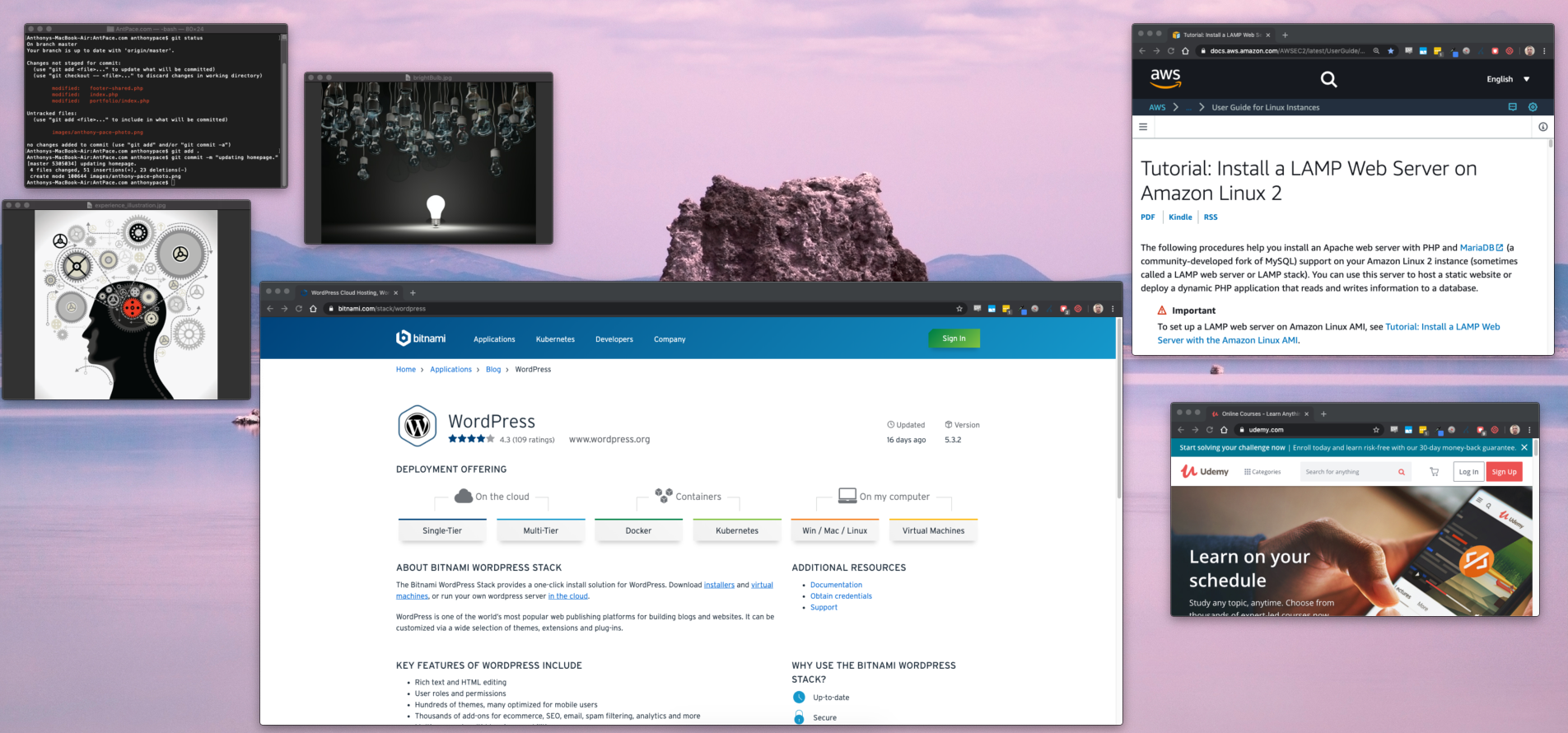
I regularly use AWS services for cloud computing, storage, and databases. My go-to for a new project is to spin up a EC2 instance. If I know I’m using WordPress, I may use a Bitnami AMI. Other times, I’ll create a basic Linux box, and setup Apache, MySql, and PHP myself. Here is the documentation I regularly reference: Install a LAMP Web Server on Amazon Linux 2. This process usually includes configuring a domain name, and setting up SSL: Configure SSL/TLS on Amazon Linux 2.
I’ll continue this post as a series. I plan tell stories about my experiences in building digital products. I’ll cover topics such as design, marketing software, customization, and APIs. Follow me on Instagram for regular updates: @AntPace87
Working at an agency for years
For many years I worked a software development agency that specialized in start-ups. It had a close partnership with a private equity firm in Manhattan. During that time I really learned the proper way to work in a team as a software engineer practicing agile project management methodology. The office was co-located on 5th avenue in a shared services dynamic with well-funded start-ups. I got to build the tech for companies across industries. I will continue to recall and write about those experiences here.
Building my own digital products
I’ve written blog posts about the products I’ve built, launched, and marketed. I’ll reference them here. Also, you can find them on Indie Hacker.
Modern software has given creators the tools they need to showcase their work to the world. Here are the best free apps that I’ve been using that will help your talent shine in 2019:
AppWrap – Do you want to feature your latest website or app design to your followers? Are you building a portfolio for the UI/UX projects you worked on? This app is a great way to wrap your screenshots in a mobile device view. You can add effects, backgrounds, and text to really polish the look and feel. Their template gallery will give you inspiration to make something gorgeous. http://www.appwrap.in/
Canva – This is one of my favorites. With a library of over 60,000+ templates, this app has something for every platform. Whether you need to create a great looking post, story, or cover image, this app has designs for Instagram, Facebook, YouTube and much more. If you want your online presence to look professionally designed, check this one out! https://www.canva.com/
Hatchful – Do you need a logo for your brand, business, or product? This app let’s you create one quickly. By customizing templates, you can draft, and iterate designs. Having logo design done fast, cheap, and easily allows you to focus on the actual product. It’s important to not get hung up on the logo, especially early into your venture, and instead focus on the actual value your service proposes. https://hatchful.shopify.com/
I’ve used all of these apps, and personally gained value from them. What apps do you use for your graphic design?
It was 2006 and I had just installed WordPress on a web server. I would draft blog posts nightly, before getting ready for bed. At the time I was a philosophy major and wrote prose more than code. That was my first venture into web development and digital marketing. It started with writing.
Writing blog posts and publishing software have a lot in common. For both, “perfect” is the opposite of ready. It’s easy to keep editing your own work. It’s even easier to keep adding half-done features and clutter. That’s why having a plan before you start helps so much. When I write, my first draft tends to be bullet points and a vague outline. The same goes for software. If I’m building something complex, I write comments explaining its functionality before any code. It’s my way of “thinking out loud”, and making sure that what I plan on doing even makes sense.
It’s been over a decade since I’ve maintained a blog. Creative tasks require hard work, lest they bear no fruit. (“Writer’s block is for amateurs”). Problem solving, in its many shapes, is the highest form of creativity. It’s how we build our reality. Modern technology gives us creative leverage through tools, knowledge, and community. We’re being given opportunities to build and create things, to grow and be better, at an unprecedented scale. It’s the best time in history to be CEO of your own life; creative director of your destiny. This also sets the bar higher to stand out.
My plan here is to write regularly, and discuss what I’ve been working on and learning, as well as what’s next. This gives me a chance to explore my thoughts, and prune the branches from which they stem. Hopefully, working at this will help to make me a better storyteller too. This blog is my notes and stories from the field, on the ground!
The benefits of reading are well documented and enumerated. If you are a programmer, reading helped get you to were you are. Of course, as with any intellectual pursuit, consuming prosaic knowledge is a pre-requisite to success.
Having the time to read, think, and write is a luxury. It’s a habit that that many people claim they can’t afford. And ironically, those are the people that could benefit from it the most. Like strength training, it is something I’ve habituated myself to do daily.
Reading makes you a better software engineer, not because of the information ingested, but because of the byproduct mental skill built as a result. Reading, regardless of the subject matter, is strength training for your mind. It is a neighbor to meditation and mindfulness in regards to brain health.
And, to make the connection explicit: if reading benefits your coding ability, then meditation does too. I’m not the only one that thinks that meditation will make you a better programmer. Reading, and writing, can be meditative pursuits that afford the benefits enjoyed by mystics and monks, engineers and enigmatics*. Consuming knowledge is, in many ways, a programmer’s primary function. Let’s delve into the realms of reading and writing that act as superpowers in molding our intellect and efficiency.
Reading
Literacy seems to date back nearly five-thousand years. It might be even older. I wouldn’t be surprised if the timeline of civilization and humanity turns out to be much longer than what is currently accepted by historians and scholars. Reading and writing are low-tech, non-electrical, super powers that define and augment what it means to be a modern human. Like meditation, reading changes the brain’s physical structure.
Reading is a skill. Even if you “know how to read”, true literacy is highly perishable. Amber Peterson from The NCTE writes, “literacy is the way that we interact with the world around us”. Following the video-game, simulation theory, analogy – being literate is the opposite of being an “NPC” in real life.
This type of literacy flexes same brain muscles as mindfulness. It is the kind of mindfulness that allows us to actually experience life, or what Sam Harris calls “waking up”. Even if you live a very long time, if you were a mindlessly zombie the entire ride, then it might as well not even have happened.
Filmmaker Stephen Apkon is quoted as saying “True literacy is always a two-way transaction. We don’t just consume; we produce. We don’t just read; we write.”
Spoken communication already feels magical. From an alien perspective, it seems I can sing sounds to export my thoughts and ideas into another person’s mind. Writing, then, is an evolution of this transcendent practice that allows brain data to be store, shipped, and unzipped without a livestream.
Listening
Audiobooks unlock a new way to consume written words. Many people find it easier than reading. I think that is because it requires less focus. If I listened to a book, can I say that I have “read” that book? My opinion is “yes”, but does that mean that I can say that I have also “read” a podcast? Do we need new terminology to better describe our world?
I can get through a publication more quickly by listening. But, does that forsake the benefits of increased focus that I discussed above? Entrepreneur Naval Ravikant tweeted, “Listening to books instead of reading them is like drinking your vegetables instead of eating them.”
I love that analogy. It’s still good for you, but there is clearly something missing. And, how Faustianly modern it is to prefer a more processed option in favor of palatability. In another tweet, Naval says, “Reading is more efficient when at rest. Audio is more efficient when in motion.”
I agree, and reserve Audiobooks for when I am moving – walking, exercising at the gym, or even driving. Brian Tracy, author and top business-speaker, said “You can become one of the smartest and most knowledgeable people in your field by turning traveling time into learning time; by turning your car into a mobile classroom,”
I first discovered this concept of a “university on wheels” around 2008 after listening to one of my first-ever Audiobooks, “The Phoenix Transformation“. Around that time I had just finished college, and was trying to figure out what to do with my life. My primary source of income was delivering pizza, so I was on the road a lot, alone in my car.
This was before smartphones were popular, and as a poor young person, I could not afford a stand-alone MP3 player. I was able to download books and other audio programs (Tony Robbins changed my life), and burn them onto blank CD-R disks. A single book might be ten CDs long. If I heard something impactful or if there was an exercise prompt by the author, I would pull over and scribble my thoughts down onto a blank “guest check” pad, sparking the origins of my hypergraphia.
Tips, Tricks, and Recommendations
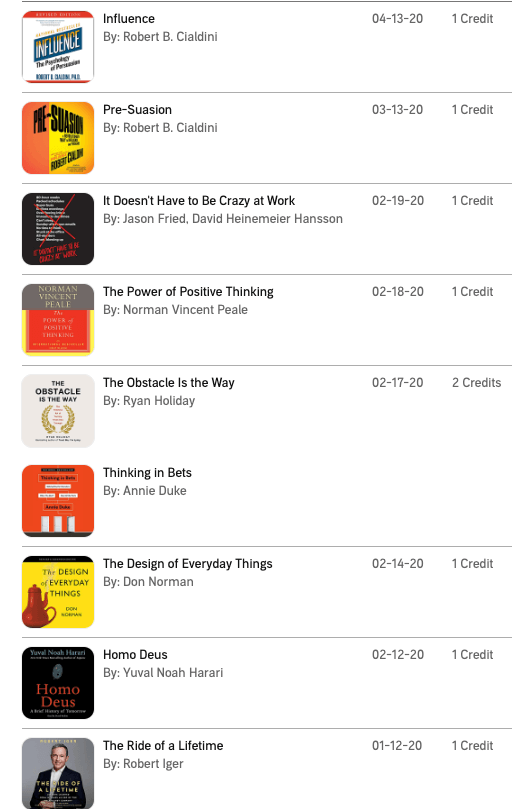
I recommend reading and writing every day. I like to have two or three physical books that I switch between at home. The Kindle app is my electronic option for when I’m out and have a few minutes to kill. My Audible account keeps multiple audiobooks queued that I can switch between at the gym or on long walks. Here is a list of the books that I listened to in 2020:
Read multiple books, and start new ones before you’ve finished them. Don’t worry about putting a book down and never picking it up again: Life is too short to finish books that you don’t like. Audible allows audiobook returns and refunds credits for reuse.
There’s so much content available, it is hard to decide where to direct your focus. As a rule, I try to not read any new books – meaning, I won’t read material that has been recently published. As a soft rule, I like books that have been released at least five years ago.
I avoid read popular books and best-sellers. I’m excited by obscure material containing alternative, even radical, ideas. If you only read the same books as everyone else, you will only have the same ideas that everyone else is having.
Reading will make you a better writer and content producer. Niall Ferguson mentions that quality books tend to have a thousand-to-one ratio; meaning the author has read about a thousand words on the subject for every one word written.
Niall continues about the compounding benefits of reading: “You’ve got to get that reading speed up early, and then you just have to read and read and read. And it is cumulative, not only in the sense that you get better at reading, but in a fascinating way the knowledge that you imbibe from books is cumulative.”
I am a slow reader. And, I am okay with that. I spend lots of time, in between sentences, thinking and contemplating. My advice is to not try reading faster, but instead to read for longer amounts of time. Like anything worth pursuing, it is about putting the hours in. “Reading is the quiet time in which you reflect and learn,” says author Ryan Holiday.
Writing
The best reading habit that I can recommend to you is to write while you read. A professor once told me: If you don’t have a pen in your hand, you’re not really studying. It ensures that you stay focused and engaged, and trains your mind to not wander. I have mentioned before that writing is “calisthenics for the brain“.
Digital devices, like the Kindle, make it easy to highlight text and take notes. After each page, I like to jot down a synopsis or any tangental thoughts that were sparked in the past few minutes. I don’t read fast. I record and define any unfamiliar words, and keep lists of unique phrases and idioms.
If I really like a new word, I’ll rewrite it and what it means, multiple times. Sometimes, I’ll rewrite sentences that just sound nice, or have a musical quality to them. Then, I’ll try to author my own in a similar style.
Taking notes is a challenge when I listen to audiobooks. Audible provides a feature allowing listeners to bookmark audio clips, and add text comments. Periodically, I’ll audit my collection and transcribe my favorites into a journal.
Journaling To Be A Better Writer (And Programmer)
Private journaling is vital to my process of writing publicly (blogging). I write a lot of stuff that I never publish. And that is the point – it is a personal practice that makes everything public-facing better. That idea is inspired by Kevin Kelly who has said, “I write primarily to find out what I’ve been thinking, and I don’t know until I write it”. The common wisdom is that you should think first, and then write – but to me it is obvious that the reverse is true. Spilling lots of ideas down onto a page is how I get started.
Note taking, making lists, and other kinds of journaling are powerful tools for being prolific. Learning how to make and take good notes requires practice. Simple bullet point lists are an easy way to start. Morning journal pages serve as a long-form translation of the lists I scribble mixed with a stream-of-consciousness narration. I try to write something every single day – no zero days. That’s how I get the noise out of my head. It crystalizes the nebulas storm that rages within my “monkey mind” – a concept I borrow from Tim Ferriss.
The magic always happens when I go back to old scrap and put the editor hat on. I have multiple physical notebooks, and use Evernote on my digital devices. I jot down thoughts, copy ideas while I read, write down new word definitions, and try to fill an entire page with free-flow journaling each day. Organizing all of these sources has become a series of techniques I use to keep finding inspiration.
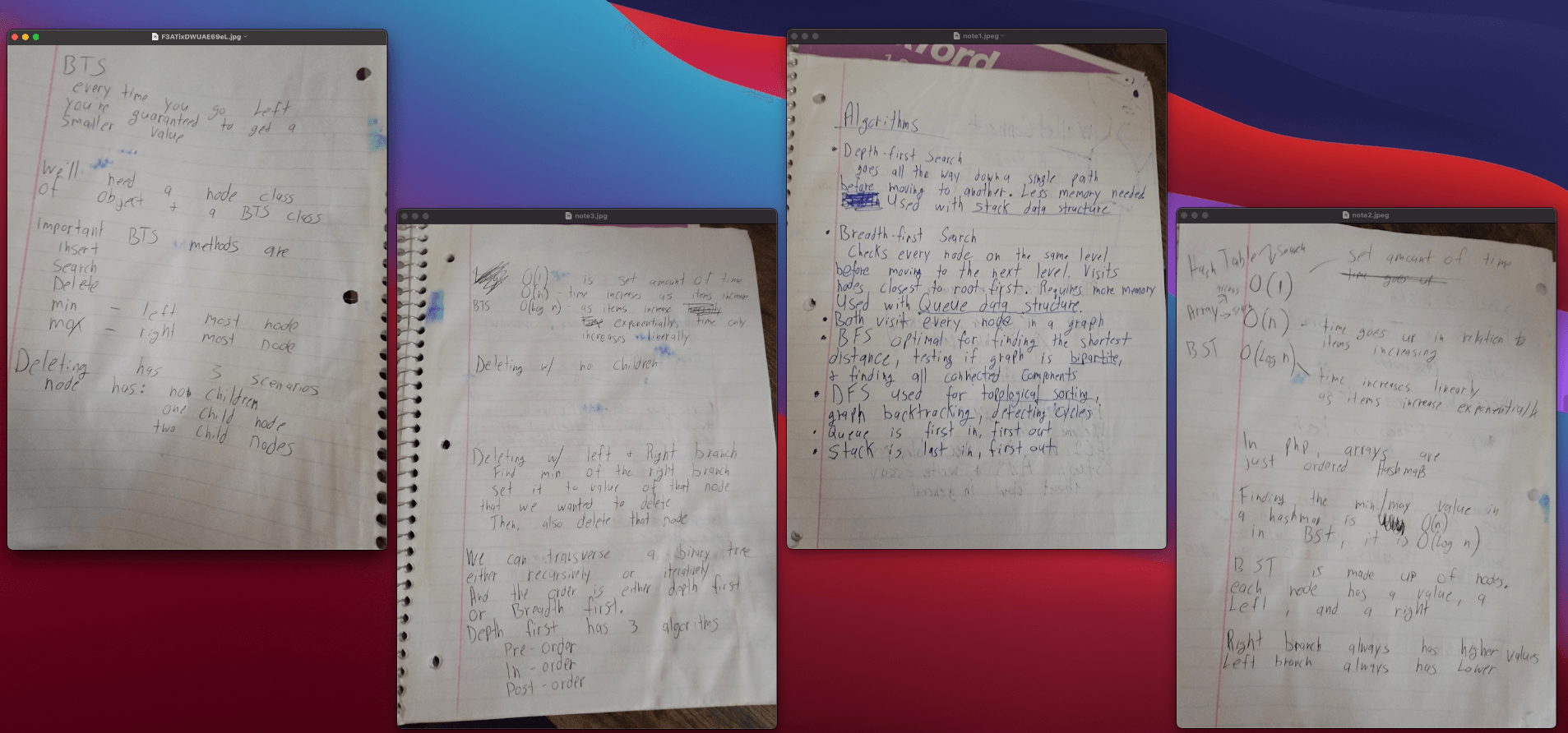
Digesting the messy ball of words is aided by adding lots of visual cues. I use different colored pens, add drawings and doodles. I lay index cards out on an empty space and take a photo. Volume is the important variable in this quality algorithm. Getting as much down on paper as you can is always the best first step to getting value out of the writing process.
Hand written notes while studying computer science algorithms
A coder’s diary
Taking notes about the coding challenges you’ve solved and the technical knowledge you’ve learned cements it. Even if you never read your notes again, the act of taking pen to paper will deepen the grooves in your mental records. You should consider keeping a blog for this reason. Having an archive of your experiences expounded, with the ability to search keywords, is invaluable. I include code examples, screenshots, relevant links and quotes, and a story to add context.
That compliments my main point: writing prose will ultimately make you a better programmer. Coding is a discipline nearer to writing then it ever will be to mathematics. That seems counterintuitive to the uninitiated.
This blog acts as my technical log that I can back reference when I encounter a familiar problem. As time passes, and new projects take hold of your attention, it’s easy to forget how you did something, even a few months ago. If you also have a similar blog about tech send me a link – I’d love to read through it!
Note Taking & Processing
There is an art and skill to note taking. It is a neighbor to journaling. When I have the urge and energy to do work, but I am not sure where to begin, I hit my notebooks as step number one.
My process has evolved. I start with physical writing as my primary note taking method. I use a notebook and I use index cards. Eventually (at least months, sometimes longer), I revisit hand-written notes and “process” them. That “process” involves re-reading and commenting on them in their existing form. I move the important (and positive) things to Evernote. I have organized my Evernote in multiple Notebooks. My pipeline looks like: index cards -> notebook -> Evernote -> blog
I use Twitter as a public diary for single sentences, ideas, and quotes that won’t fit any where else.
Since this post is a WIP (work-in-progress), I’ll leave unpolished notes below. That way I can continue refining my thoughts on this subject as time goes on.
– The psychological benefit of writing out negative feelings, and later destroying the paper. (“Burn after writing”)
– Looking back on goals. Reviewing old budgets, and feeling gratitude for where I am now
– Doodling and drawing skills
Writer Kurt Vonnegut said about his process: “When I write, I feel like an armless, legless man with a crayon in his mouth”
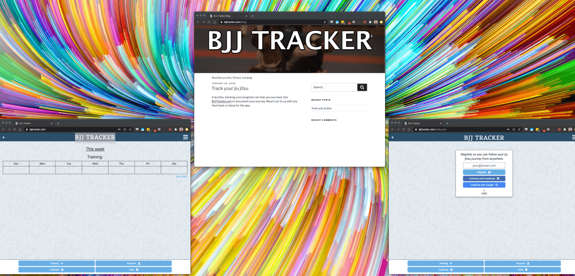
BJJ Tracker is a fitness app for tracking Brazilian jiu jitsu training. It’s the sort of fitness app I was looking for, but couldn’t find. Version 1.0 is a bare bones MVP, but has a list of features on the way. Future versions will add gamification (including challenges and goals), UX/UI enhancements, training recommendations, and more.
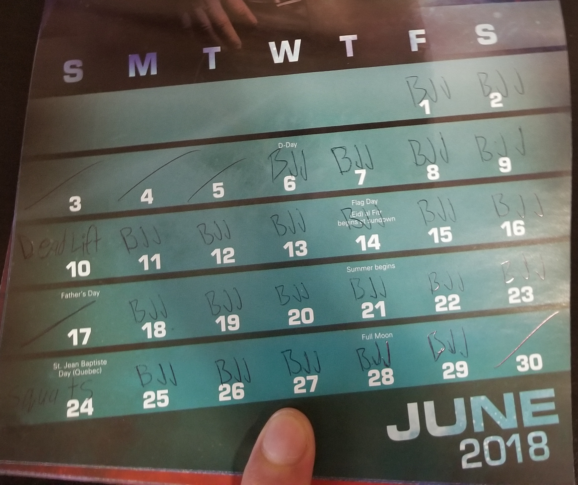
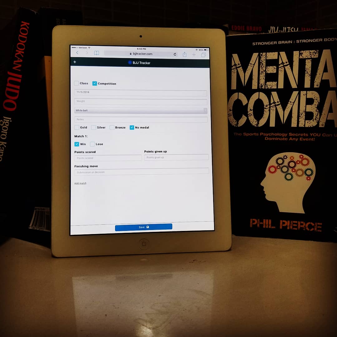
The app allows users to record their training sessions, with details about drilling and sparring, as well as competition. This data is visualized over charts and calendars. The idea started from physically writing my training sessions onto an actual calendar, with a minimum goal per week. Building it has been a great exercise in digital product development, software design, and UI/UX strategy.
Software
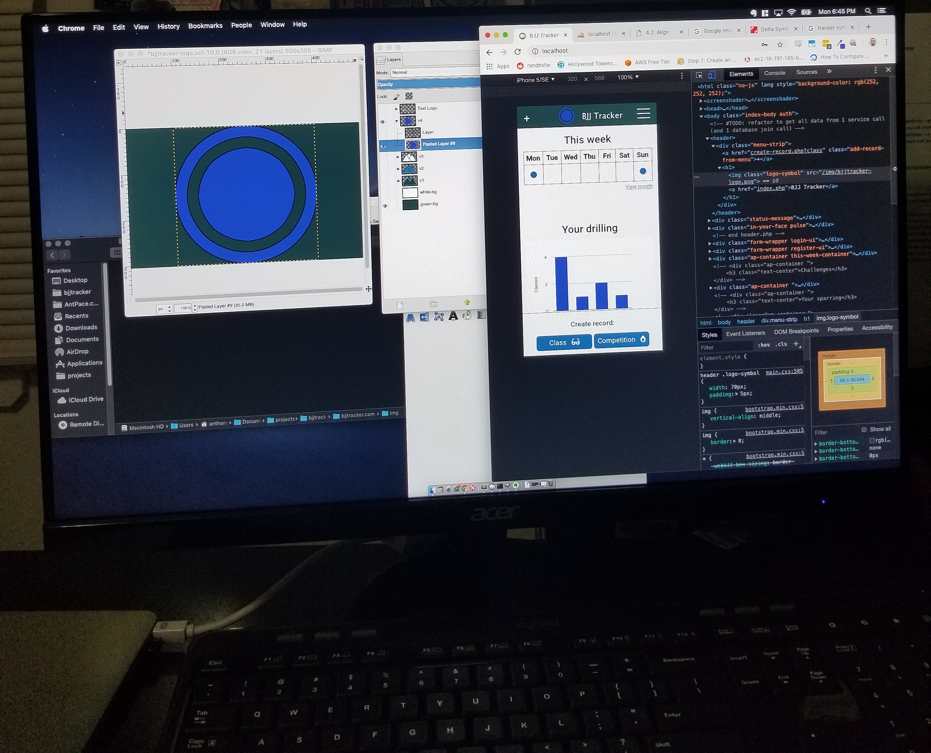
BJJ Tracker is a web app, hosted on a AWS Linux server, running Apache, PHP, and MySql. I used Initializr to generate a bootstrap template to get my front-end started. One goal of this project was to build a web app framework that I could use to quickly get future projects running. This code would include user registration and login services, as well as other back-end concerns, on top of a front-end. I’ve cleaned most of this code into a generic repo on GitHub. You can read my post explaining its features.
Design
This app was designed with “mobile first” in mind, assuming that most users will be on a smart phone. The look and feel of the color palette, font-choice, and UI layout took some experimenting and visual research. It’s not final, and will be subject to split testing over time. I used Font Awesome to add icons as visual cues, giving the app a more finished look. The three lined (hamburger) menu in the top right comes as standard UI, using Simple MobileMenu, a jQuery plugin. Other UI elements include a top status message, and “In-Your-Face” status message, both of which are custom built notifications that I’ve wrapped as javascript plugins. Having a calendar section was important to me, and I consider to be a primary feature of the app. I use Full Calendar to generate the full month view. The homepage (dashboard) focuses on a week view. Google charts is used for the “techniques” graph.
The logo is a work-in-progress. The textual part was easy – pick a font, add a sharp outline, and a drop shadow. I always start with a 1024×1024 canvas. The symbol begins with simple shapes, triangles and circles. I left this process for last, saving my focus for the actual product. This allowed me to rapidly iterate design versions, and see how it would look directly in the user interface. Below is the current portrayal – and I’m excited for next versions.
BJJTracker.com
Full Calendar
Fullcalendar.io has been my go-to solution for adding Calendars to websites. It’s free, and only needs two file references to work (a CSS file and a JavaScript file). You can host those files your self, or use a CDN. And, the UI is easily customized with a bit of <style> code:
You can see I get the back-end data through my PHP code (view_record_response), and pass it along on the front-end (eventsArray) to FullCalendar.
Challenges and next steps
One goal of this project was to get started fast, so people could begin using it. Deciding what to include out of a long list of ideas proved challenging. I could have kept adding features, and never been ready to make the site public. I meant to keep functionality basic, but still wanted the thing to be useful. The design needed to be simple, yet still had to look finished. I won’t know how close I came to getting this right until I analyze user feedback. The real plan is to do a little bit better next time, and to keep iterating. Using this as foundation will let future ventures start a step ahead. Already, I’ve begun implementing updates, and getting ready to deploy to the App Store and Google Play. Look out for coming updates and other products that are in the works! Don’t forget to visit the BJJ Tracker blog.
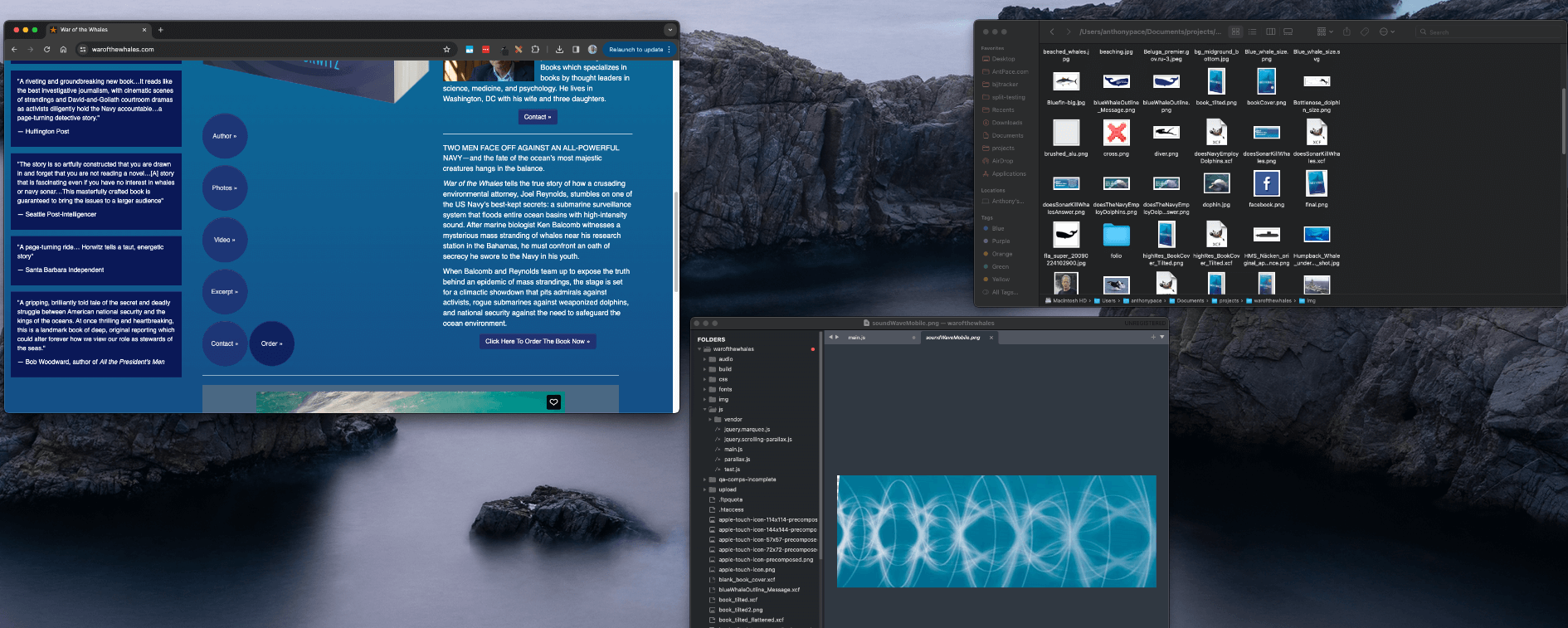
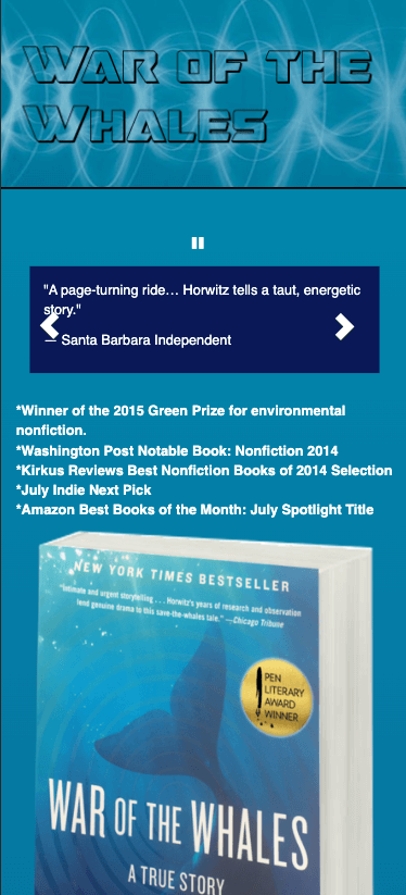
A vendor (video producer) to the company I worked for, who had is office on the same floor as us, mentioned in the hall way that he had a friend who needed a website. His friend was an author who just had a book published by Simon and Schuster. Joshua Horwitz released “War of the Whales” in 2014. I built his website from scratch using Bootstrap CSS and HTML5 boilerplate. It’s responsively designed, so it adjusts for mobile devices.
I even implemented a custom CMS mechanism, powered by TinyMCE, that was super light weight. It allowed him to update a few pieces of small content through out the site. It used basic authentication, and wrote to a MySQL database.
I used some cool visual effects to add animation and make it feel like an immersive experience. The design process took many iterations, but we got it to a place that made sense for the project. The marquee jQuery plugin used the following code:
$('.marquee')
    .bind('beforeStarting', function(){

    })
    .bind('finished', function(){
       $('.marquee').marquee("destroy");
	   $(".marquee").css("overflow", "scroll")
    })
   .marquee({
	//speed in milliseconds of the marquee
	duration: 7000,
	//gap in pixels between the tickers
	gap: 0,
	//time in milliseconds before the marquee will start animating
	delayBeforeStart: 0,
	//'left' or 'right'
	direction: 'up',
	//true or false - should the marquee be duplicated to show an effect of continues flow

	//pauseOnHover: true
})
Project proposal
Looking back at the original agreement, this is what be planned before the project began:
“I will provide two initial design direction samples. You can choose either direction, request changes, and/or combine elements from each sample. Prior to this step, you can send me examples of what you would like your website’s look-and-feel to be similar to, as well as any other specific requests regarding functionality, style, and layout. Following this, we can go through up to two more rounds of revisions regarding the style, layout, and functionality of your website. You will provide any information, text, and images (photos, logo, etc.) that need to be displayed on this website. Any stock images that we may choose to purchase for this website will cost extra.”
It was a fixed price agreement, but I added this paragraph to our documentation:
“I know from plenty of experience that fixed-price agreements often limit you to your first idea about how something should look, or how it might work. I don’t want to limit either your options or your opportunities to change your mind. If you do want to change your mind, add extra sections or content or even add new functionality, that won’t be a problem. You will be charged an hourly rate.”


