CSS Grid: Border Between Each Row

CSS Grid borders

User Interface Layout with CSS

CSS Grid is a layout system that allows you to design web interfaces with rows and columns. In earlier times, developers used less elegant techniques to arrange UI elements. In the 1990s, using HTML tables was the standard way. Many of my earliest clients used tables for their entire website and email newsletter code bases. During that time Dreamweaver was a popular product that let designers build websites and generated source code that was mostly tables. The semantic problem what this approach was that we were using tables for non-tabular data.

By the 2000s, the CSS float property became popular for multi-column layouts. We didn’t see Flexbox until the mid 2010s. You can read about examples of its use in the layout of my blog  and an image carousel I built.

CSS Grid

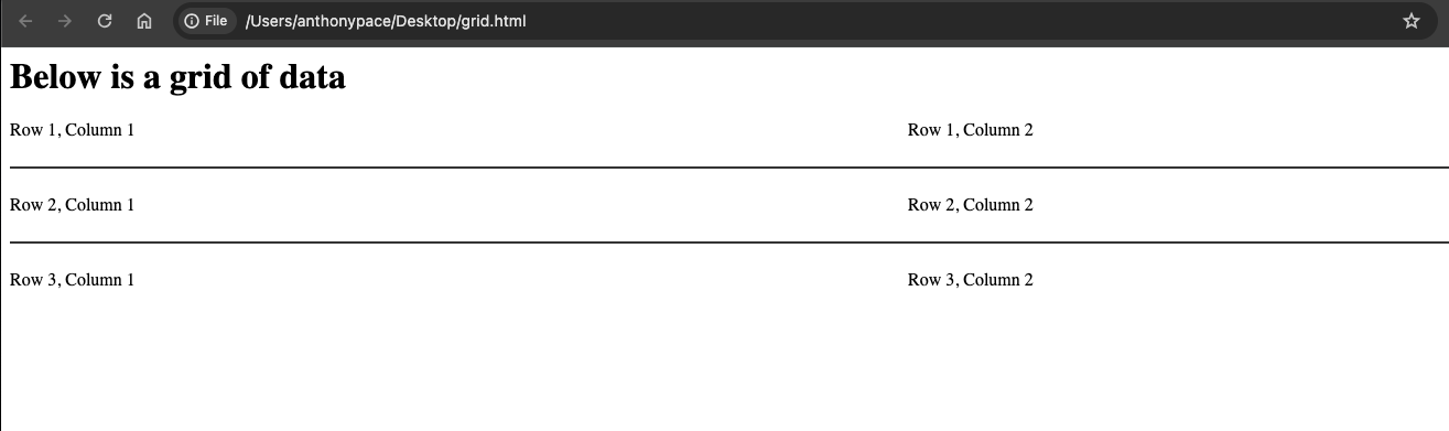
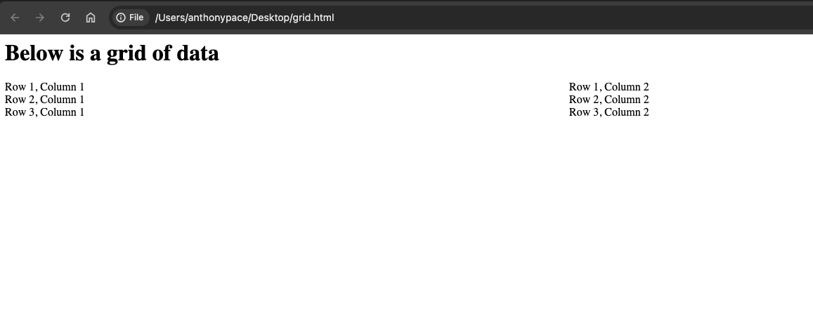
Grid is the latest addition to the toolbox of options. For a recent project I used CSS Grid to create a two column web application. Here is some example HTML:

<h1>Below is a grid of data</h1>
<div style="display: grid; grid-template-columns:repeat(2, 1fr); grid-gap: 24px">
	<div>Row 1, Column 1</div>
	<div>Row 1, Column 2</div>

	<div>Row 2, Column 1</div>
	<div>Row 2, Column 2</div>

	<div>Row 3, Column 1</div>
	<div>Row 3, Column 2</div>
</div>

The grid container has a property: `grid-template-columns:repeat(2, 1fr);`. The CSS property grid-template-columns is used to define the number and size of columns in a CSS Grid layout. This repeat() function is used to repeat a pattern a specified number of times. In this case, the pattern is defined by the second argument, 1fr. fr stands for “fractional unit.” This property is describing two columns, with each item taking up an equal amount of space. This is what it looks like:

grid css layout

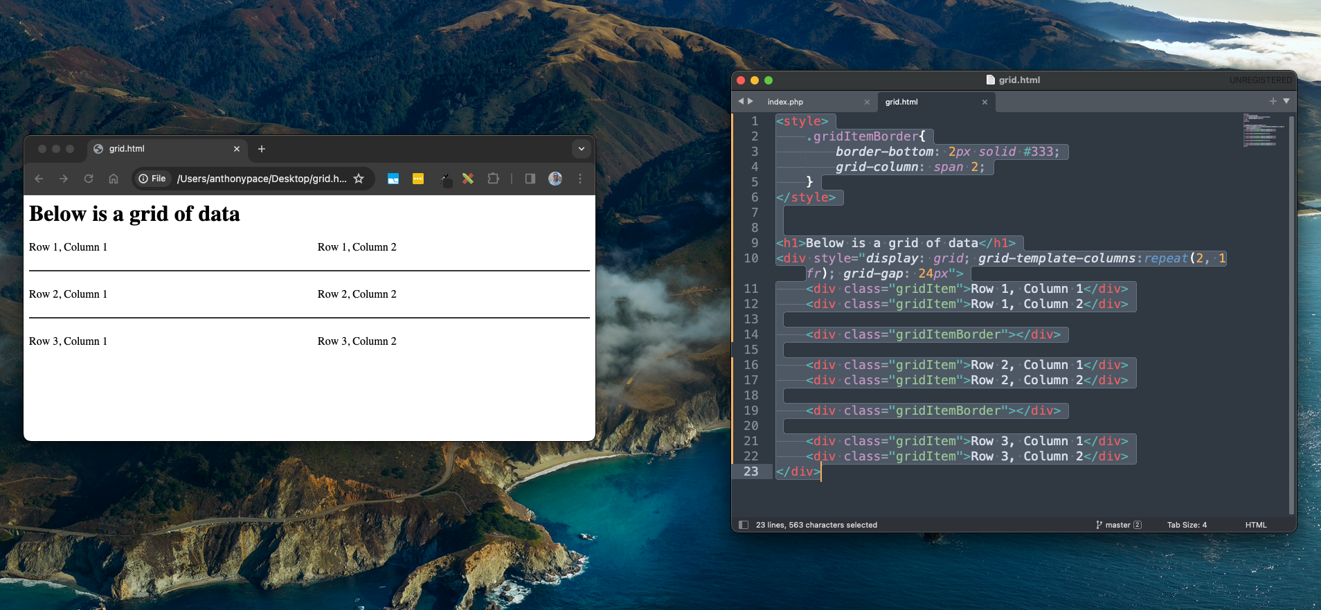
I wanted a horizontal line to separate each row. Usually, just adding a border-bottom to each of the grid items will work. In this scenario, the grid design called for a grid-gap property that forced the border to break.

css grid-gap

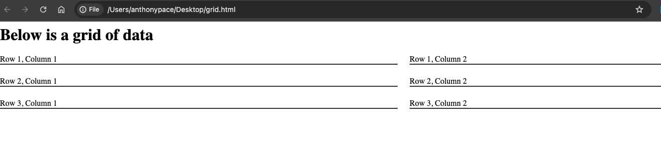
We fixed this by adding a new grid item between each “row” (that is, every third element). Those elements would represent each border line. I set the grid-column property of those elements to span two columns.

<style>
	.gridItemBorder{
		border-bottom: 2px solid #333;
		grid-column: span 2;
	}
</style>


<h1>Below is a grid of data</h1>
<div style="display: grid; grid-template-columns:repeat(2, 1fr); grid-gap: 24px">
	<div class="gridItem">Row 1, Column 1</div>
	<div class="gridItem">Row 1, Column 2</div>

	<div class="gridItemBorder"></div>

	<div class="gridItem">Row 2, Column 1</div>
	<div class="gridItem">Row 2, Column 2</div>

	<div class="gridItemBorder"></div>

	<div class="gridItem">Row 3, Column 1</div>
	<div class="gridItem">Row 3, Column 2</div>
</div>

The end result is just what we wanted:

css grid layout with row separators

Radio button value checked from a database in PHP

Form input with PHP

When building software user interfaces, I create HTML forms to manage any app settings. I’ll usually have a few text and radio inputs like this:

settings input form

Using PHP, I grab a database record and access its properties to populate the form. Filling out the text inputs is straight-forward:

<?php $clickToCallRecord = $db_service->getClickToCallRecord($installation_complete_id); ?>

<div class="form-group">
    <label>Phone number:</label>
    <input class="form-control" type="tel" name="phone_number" value="<?php echo $clickToCallRecord['phone_number']; ?>" placeholder="(123)-456-7890">
</div>
<div class="form-group">
    <label>Message:</label>
    <input class="form-control" type="text" name="message_text" value="<?php echo $clickToCallRecord['message_text']; ?>" placeholder="Call Us Now">
</div>
<div class="form-group">
    <label>Background Color:</label>
    <input class="form-control" type="text" value="<?php echo $clickToCallRecord['bg_color']; ?>" name="bg_color">
</div>

Checking the correct radio input requires our code to evaluate the data value. I add a PHP variable to each of the inputs as attributes. Those variables will render to either “checked” or blank:

<?php
    $top_checked = "";
    $bottom_checked = "";
    $position = $clickToCallRecord['position'];
    if($position == "top"){
        $top_checked = "checked";
        $bottom_checked = "";
    }else{
        $top_checked = "";
        $bottom_checked = "checked";
    }

    $show_checked = "";
    $hide_checked = "";
    $display = $clickToCallRecord['display'];
    if($display == "show"){
        $show_checked = "checked";
        $hide_checked = "";
    }else{
        $show_checked = "";
        $hide_checked = "checked";
    }

?>

<div class="form-group">
    <label>Position:</label>
    <div>
        <div class="form-check form-check-inline">
          <input <?php echo $top_checked; ?> class="form-check-input" type="radio" name="position" value="top">
          <label class="form-check-label" for="matchtype">Top</label>
        </div>
        <div class="form-check form-check-inline">
          <input <?php echo $bottom_checked; ?> class="form-check-input" type="radio" name="position"  value="bottom">
          <label class="form-check-label" for="matchtype">Bottom</label>
        </div>
    </div>
</div>
<hr />
<div class="form-group">
    <label>Display:</label>
    <div>
        <div class="form-check form-check-inline">
          <input <?php echo $show_checked; ?> class="form-check-input" type="radio" name="display" value="show">
          <label class="form-check-label" for="matchtype">Show</label>
        </div>
        <div class="form-check form-check-inline">
          <input <?php echo $hide_checked; ?> class="form-check-input" type="radio" name="display"  value="hide">
          <label class="form-check-label" for="matchtype">Hide</label>
        </div>
    </div>
</div>

This example comes from a Shopify app that helps stores increase conversions by adding a UI element prompting customers to call a phone number.