I think it’s best to avoid using plug-ins when possible. It reduces bloat and “black-box” code.
The mobile “hamburger” menu is a staple of responsive user interface design. Users know that clicking on that three-lined icon will show a menu. It’s a modern solution to displaying long navigation lists on smaller screens.
Below is a simple rendition using basic web technology. I used this recently as part of a website that showcases the work of a graphic artist.

HTML:
Drop this code in your header file for the menu (list of links) itself.
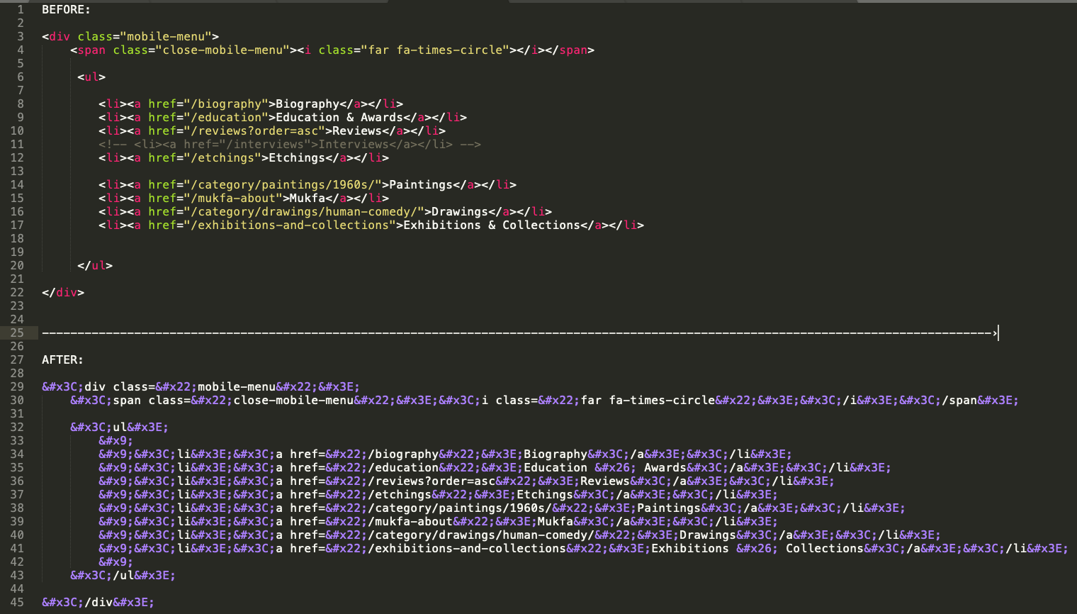
<div class="mobile-menu">
	<span class="close-mobile-menu"><i class="far fa-times-circle"></i></span>

	<ul>

			<li><a href="/biography">Biography</a></li>
			<li><a href="/education">Education & Awards</a></li>
			<li><a href="/reviews?order=asc">Reviews</a></li>
			<li><a href="/etchings">Etchings</a></li>
			<li><a href="/category/paintings/1960s/">Paintings</a></li>
			<li><a href="/mukfa-about">Mukfa</a></li>
			<li><a href="/category/drawings/human-comedy/">Drawings</a></li>
			<li><a href="/exhibitions-and-collections">Exhibitions & Collections</a></li>

	</ul>

</div>
Next, add this to your existing navigation, or wherever you’d like the hamburger button to show.
<div class="mobile-hamburger mobile-only"><i class="fas fa-bars"></i></div>
I used FontAwesome to generate the hamburger icon itself (and the close icon). Alternatively, you can use an image file.

CSS:
This code sets the hamburger button to only show on mobile devices. Mobile devices are specified at 787px or less by a media query.
.mobile-hamburger{
	font-size: 36px;
	color: #005FAA;
	float: right;
	cursor: pointer;
	margin-right: 16px;
	margin-top: 5px;

}
.mobile-menu{
	display: none;
	width: 100%;
	background: #DCC7AA;
	position: fixed;
	height: 100%;
	right: 0;
	top: 0;
	z-index: 20;
}
.mobile-menu ul{
	list-style-type: none;
	font-size: 16px;
	text-align: left;
	padding: 25px;
	margin: 50px 0px;
}

.mobile-menu ul li{
	margin-top: 15px;
}

.close-mobile-menu{
	position: absolute;
	top: 5px;
	right: 16px;
	font-size: 36px;
	cursor: pointer;
}

@media only screen and (min-width:787px) {
	.mobile-only{display: none;}
}
JavaScript:
With jQuery:
(function ($, root, undefined) {

	$(function () {

		'use strict';

		// DOM ready, take it away
		$(".mobile-hamburger").click(function(){
			$(".mobile-menu").show();
		});

		$(".close-mobile-menu").click(function(){
			$(".mobile-menu").hide();
		});


	});

})(jQuery, this);
Or, plain vanilla JS:
document.addEventListener('click', function (event) {

	if (!event.target.matches('.mobile-hamburger')){
		return;
	}

	document.getElementsByClassName('mobile-menu')[0].style.display = 'block';

}, false);

document.addEventListener('click', function (event) {

	if (!event.target.matches('.close-mobile-menu')){
		return;
	}

	document.getElementsByClassName('mobile-menu')[0].style.display = 'none';

}, false);
By the way, this is the tool I’ve been using to encode the HTML I paste into my WordPress posts (that way, it doesn’t actually render on page): https://github.com/mathiasbynens/mothereff.in/tree/master/html-entities